Animation in design mood boards
Previously I wrote about the importance of mood boards in our digital design process. As you may recall from that post, we do them because they speed up our project tremendously. Additionally, mood boards help us receiving the right kind of client feedback at the right time in the process.
The main goal of a mood board is to experiment though, and ultimately define the visual vocabulary of the brand we work for. As an example, here’s a small part of a mood board we did at Base months ago, for Belgian brand Maison Vervloet:
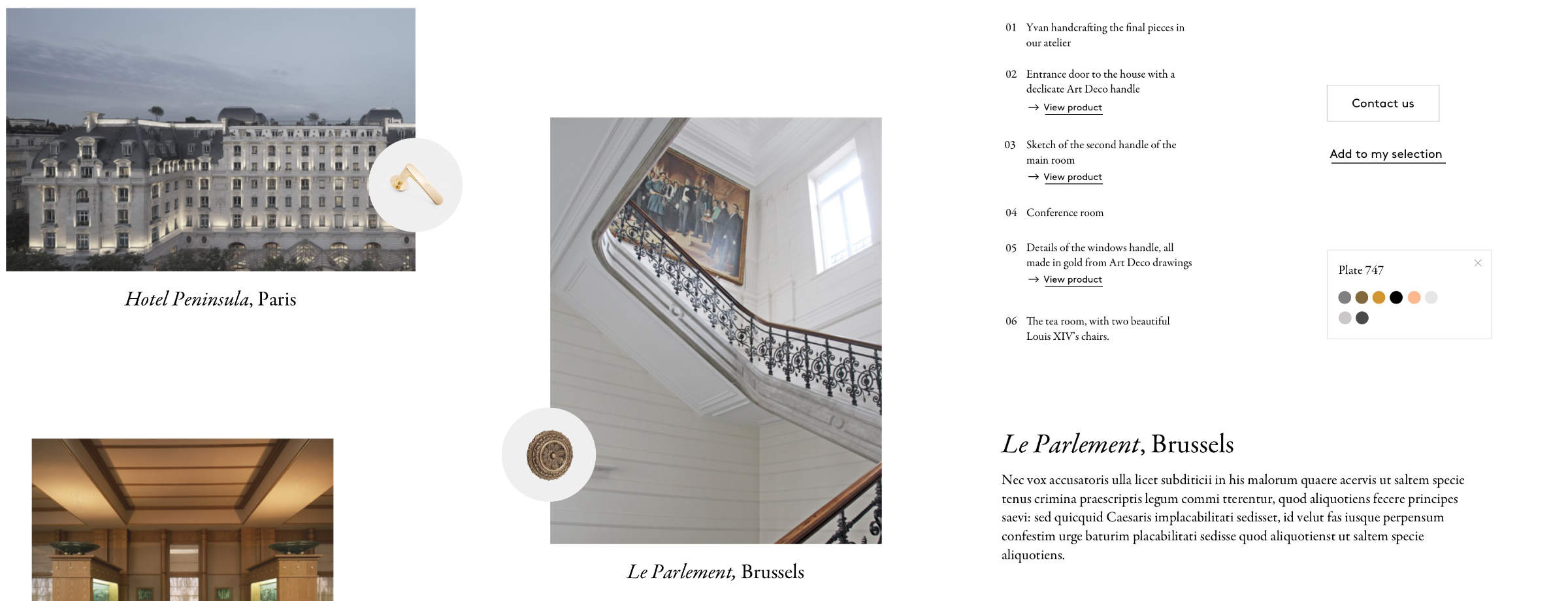
As you can see from the image above, the mood board is fully static. It’s basically a Sketch file. To present it to our clients we just export it to a jpg or png. It’s the way we did it for quite a while, and it worked great.
More recently however, we started adding motion and simple interaction design to the visual mix. It started as simple as drawing a button hover state, then actually representing it in the mood board as an interactive thing.
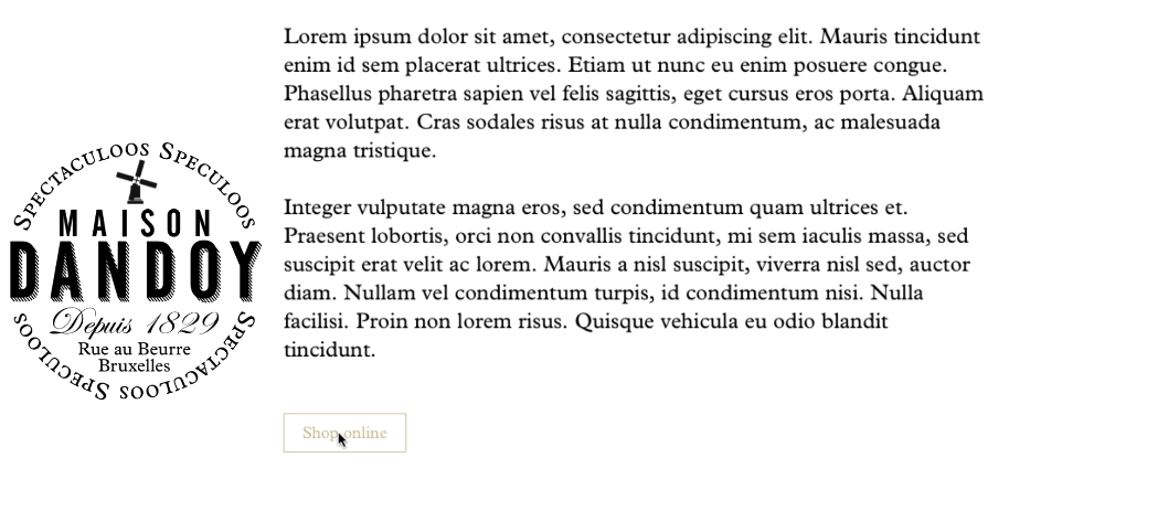
We figured a small video loop is enough to communicate the idea, as you can see in this detail from the mood board we created for Brussels brand Maison Dandoy:
Nothing ground-breaking there, but of course this means we don’t fully design the mood board in Sketch anymore. Interaction and motion are prototyped in tools like Principle or Framer, or directly in code. It really doesn’t matter how it’s done, as long as it’s quick and conveys the mood.
When we are done designing, we create an HTML page. This page will be the actual mood board we present to our client. It features dozens of pngs exported from Sketch, alongside video screen captures of the interactive prototypes.
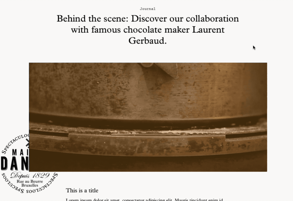
Of course the advantage to presenting the mood board as an HTML page, is that we can sneak in bits of CSS and JavaScript if we want to. Here’s an example where we added a playful animation on scroll to the otherwise static Maison Dandoy logo. We used simple JavaScript for that:
![]()
As a mood board makes no commitment to the end result and takes place very early in the design process, there’s still plenty of room for experimentation.
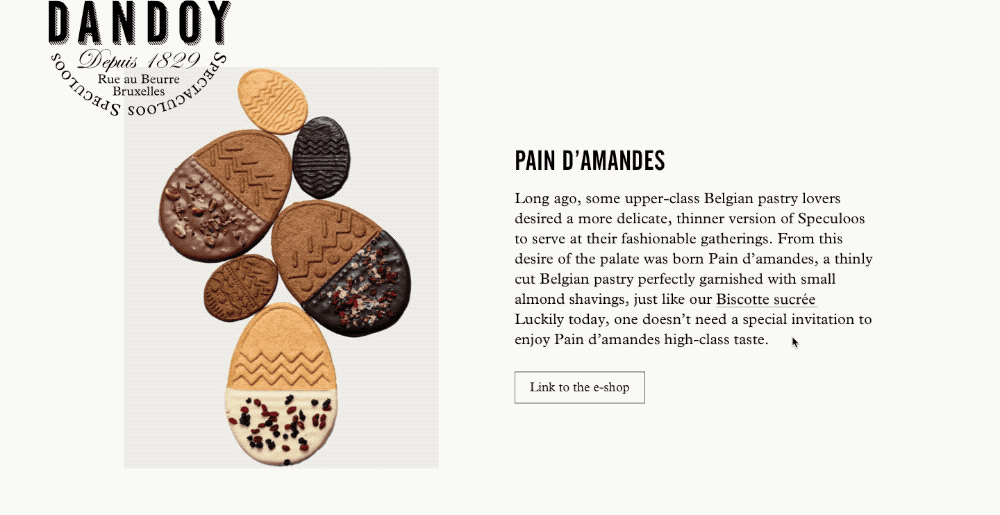
Here’s an over-the-top hover effect we sneaked in that could show Dandoy website visitors what a biscotte sucrée is. It definitely made for an interesting discussion when we presented it to the client:
In order to move quickly, we don’t focus on production code or getting the output perfect on all devices and browsers. That’s irrelevant as the mood board is a document that is only shared with our client and the team.
How did we end up here?
The first reason we wanted to experiment with motion directly in the mood board phase is very simple. Especially in digital, it’s as much part of a brand’s visual identity as the typeface selection or color scheme. Delaying motion and interaction design to a later phase consequently somehow reduced it to an after-thought.
The second reason is probably a direct result of that: we noticed a particular flatness in the interaction we designed. Our work was too static. While graphically great, we lacked that certain interactive finesse that comes with carefully crafted digital design.
Now we hope that by treating it as a first-class citizen from day one, it will shine through in our final results.
If you like the idea of designing web sites content-first, go ahead and give motion mood boarding a try. I’d love to hear your thoughts.