Mood boards in a content-first design process
At Base, we aim to work content-first. We don’t start designing web pages until we have all content identified. I blogged about that earlier, but here’s the rundown: we build a basic HTML content prototype for our clients and then treat design — and basically anything else that follows — as progressive enhancement to that content. It just makes sense.
Organizing and creating content takes time though. A lot of time actually. Don’t get me wrong: it’s time well spent at the beginning of a new project, as we ultimately end up with a highly useful, clickable HTML content prototype. But still, working content-first means you can’t do any visual design until the content phase is over.
Or can you? As we were looking to optimize and speed up our process, the question that inevitably popped up in my head was simple:
Couldn’t we design something visual already to present to our clients alongside the content prototype?
I mean, do we really need to finish all content before researching the project’s visual vocabulary? It’s a tricky question of course. At first I believed it to be impossible even. You can’t have your cake and eat it too. And yet there’s no doubt it would speed up the design process tremendously.
So in our latest projects, while we were building the content prototype, we tried something new: we designed a mood board simultaneously. And we did it in such a way that it never conflicted with our holy content-first philosophy. It turned out to be quite successful.
What’s a design mood board?
I was introduced to design mood boards by Jérôme and although we use it with a slight shift in purpose now, I believe it’s originally based on an idea by Samantha Warren.
In our case, a mood board is a big Sketch artboard we design. Its purpose is to visually explore and set the mood of the forthcoming web site. It’s basically a collection of random UI elements: general typography, text link styles, form fields, button states…
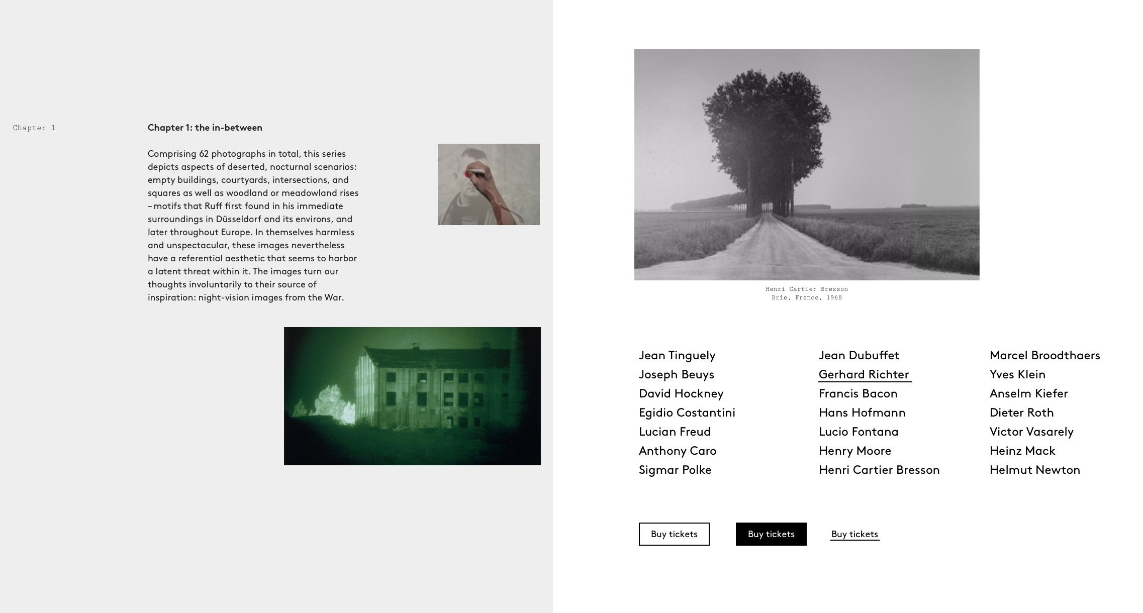
To give you an idea, here’s part of a mood board we designed for Haus der Kunst in Munich a couple of months ago:

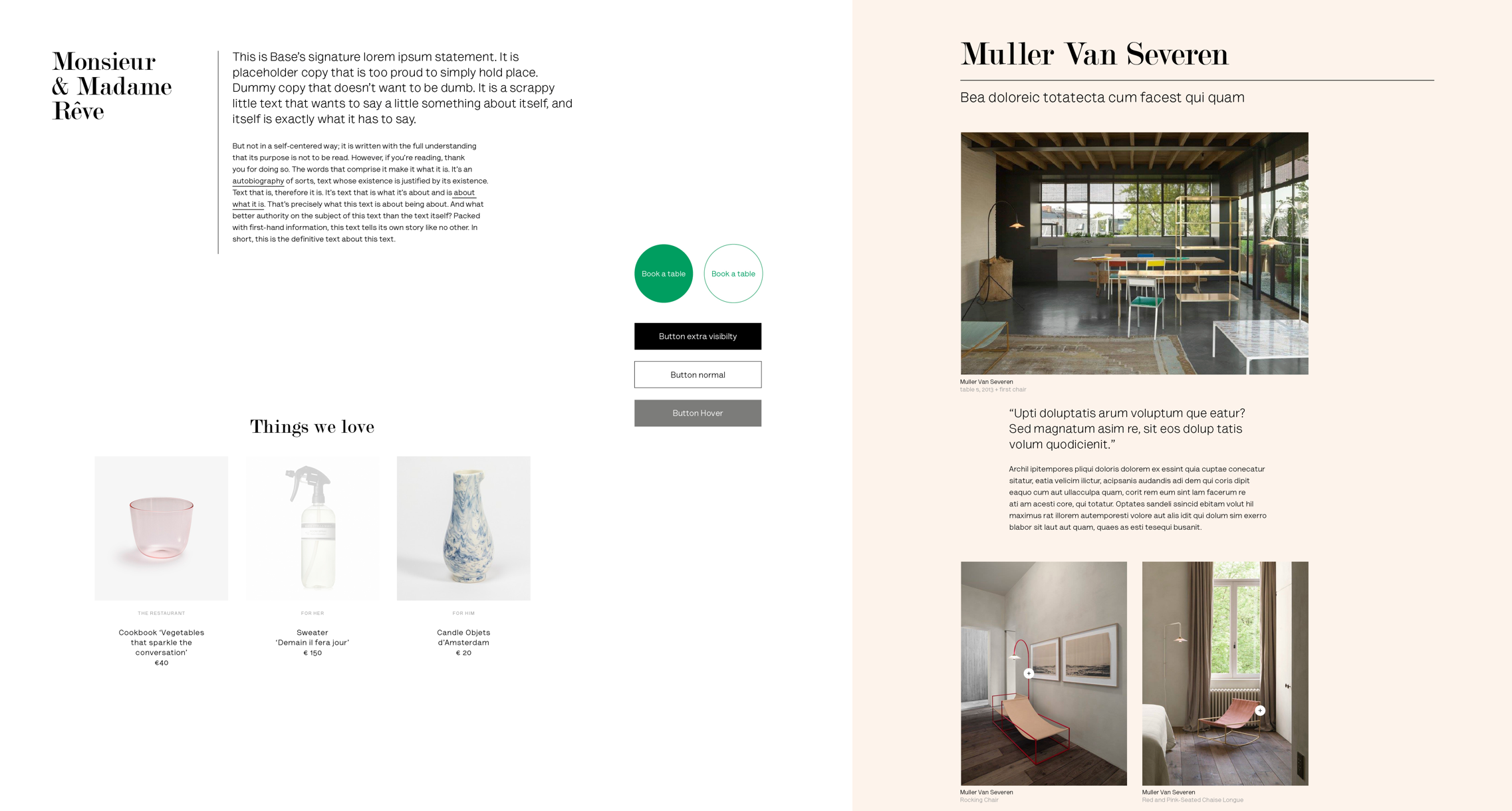
And here’s one we did for Graanmarkt 13 in Antwerp lately:

As you can see, a design mood board is still pretty rough. It’s designed from the inside out. It starts with a carefully typeset paragraph of dummy body text, and grows from there. It’s informal and allows for experimentation, but ultimately leads to a visual vocabulary that enforces the brand we work for.
How a mood board fits our content-first approach
Now let’s return to the main question: in a content-first approach, can we start visual design before the content phase is over? As often, I found the answer lies in restriction: you have to make fully sure the mood board’s only purpose is to communicate general visual style.
As long as you keep that one promise, you’re good. Because it implies you can design with fake content. And it’s precisely why a mood board can be worked on before the content is there, meaning it still perfectly fits our content-first approach.
So by intent the mood board shows no pages, no navigation, no header nor footer. That’s way beyond the board’s purpose and ultimately you really need microcopy and content for that. A mood board is not about the details. It’s about research, and defining and communicating the global visual style direction you believe is right for the brand.
Obviously, designing a mood board like this at the early content stage accelerates the process. But there’s more to it.
There’s more than meets the eye
When the mood board is good enough to represent the visual style of the website to come, you want to get it in front of your client. I show it together with the content prototype we coded. That’s awesome for a couple of reasons:
- Surprisingly, it helps clients understand the HTML content prototype better. They now clearly see the difference and the relationship between content and design. In general it helps me explain the content-first process better and it helps them make more sense of it.
- The mood board is a very low-barrier way to discuss aesthetics. That’s because it only represents the general visual mood. A lot of the UI elements clients see may not even make it into the final design of the website, so there’s no real commitment to make. It eases the discussion.
- The mood board allows you to present visual design very early in the process. That’s because a mood board is relatively quick to produce, as you’re bound by the limits of its purpose.
That last point is a very important benefit. I found that presenting something as approachable as the design mood board early in the process is valuable for multiple reasons:
- You avoid excessive expectations. Over the years I learned that the longer it takes before you present something, the more the tension builds up, and the higher the expectations grow. It’s paralyzing sometimes.
- You can adjust and fine-tune things more easily. If it took you weeks to build hi-fi comps of all key pages and UI elements, and ultimately your client is not impressed, it’s going to be a tedious process to get everything back on track. It’s just not the right process.
- And last but not least: you receive better feedback from your clients. It happens because you present the right thing at the right time. And that makes sure the discussion focuses on the right subject.
Better client conversations
Better feedback is truly a key advantage of design mood boards I hadn’t anticipated. And feedback is so important if we want to improve our work. Ken Blanchard once said:
Feedback is the breakfast of champions.
He’s right. And here’s the thing: before, when I presented hi-fi comps right away, the discussion often switched to the kind of things I didn’t really want feedback on at that point: micro-copy, navigation structure… I guess we’ve all been there.
But now, the mood board quickly leads to a discussion about typography, readability, branding and general visual style. The prototype on the other hand has everyone talk about content, information architecture and project goals. Exactly the kind of feedback you’re after at this point in the process. It’s golden.
At Base, we don’t look back. If you and your team haven’t experimented with design mood boards yet, you should give them a try. What’s to lose?