The bold beauty of content prototypes
A little over half a year ago I joined the digital team at Base. It’s been a crazy six months. And in all honesty: I struggled. I struggled with process. I struggled with communication. I struggled with clients. Front end was too far from design and content only arrived when a project was nearly live.
As a result, I shipped products lacking vision, and on top of that, I shipped too late.
That’s why a while ago, I took the opportunity of a new project to rethink our workflow. I basically wanted to address three major pain points in our process:
- Designers on the team designing in Sketch with fake or no content at all.
- Front-end being too late in the process, being too separated from design.
- Designing interactions based on gut-feeling rather than human feedback from the target audience.
I trusted that attending to these issues would lead to better products, shipped on time. I’m still not 100% sure it will, because we’re only halfway through that new project now. But up until now everything at least feels much more on track.
To hell with lorem ipsum
Looking back at it now, part of the solution was actually lying right in front of us all the time: content. Stupid, because it’s the core of what we do. We design because our clients have a story to tell. It’s only evident that this message should be the base of everything that follows.
Jeffrey Zeldman once wisely said:
Content precedes design. Design in the absence of content is not design, it’s decoration.
Right. So I took a stand, and decided to begin this new project right there, with content, before doing anything else. Content-first it is. To hell with lorem ipsum.
But how?
For static content, it’s obvious: we asked the client for anything they had already, mainly text and photos, then started from there. We worked hard on shaping everything to be in line with the unique story behind the brand.
For dynamic content, like news articles, it’s trickier. You can’t predict the news your client will publish. That’s ok, as long as you can define the structure of a news post. That’s why we require at least five to ten representative examples of news articles. It allows us to design the dynamic news system later, and prototype it with real content.
Of course we were depending on our client a lot here, but with good communication, clear deadlines, plainly outlined consequences, and the necessary help, it shouldn’t be a problem.
I do admit that at this point in the project, the process of starting content-first felt scary to me. Mainly because by now we had spent quite some time and budget already. And although we had good content, spread over various sheets and documents, we didn’t yet have anything tactile to show our client.
But I patted myself on the back for at least treating the first major pain point in our workflow. We could now start designing with real content and a clearer vision.
Prototyping content
By now, I felt I needed to get something tangible out there. Something that would allow us to easily share our work and gather feedback. I decided to prototype the content using HTML. It’s fast to create, and if we write production-ready HTML, the time spent on it now is time gained later in the process.
Here’s an example of a typical content prototype. Pretty brutalist, right?
It’s real — from day one
You now have a clickable content prototype. Version 1 of your website, so you want. It’s rough and looks like shit, but it’s real. It’s not a representation of the final product. It’s the truth. It lives in the browser, it’s interactive, it’s responsive and anyone can access it with any device. I love it. It gets the content you worked on so hard in front of people.
That last bit is important, because as soon as the content prototype was live, I shared it with our client and basically anyone who wanted to have a look. It may look bad at this point in time, but it‘s a tangible first release and that keeps the excitement high.
Moreover, anyone involved can share feedback already. Is the story interesting enough? Does the checkout flow make sense? Is the navigation pattern clear? Are there any pages in the information architecture that miss content? Maybe the pictures lack cohesion? It’s exactly the kind of feedback that is hard to fix at the end of a project, but is mostly quick and easy to correct right now. After all, it’s just HTML.
Everything that happens to the content prototype from now on is merely progressive enhancement. Because while the prototype is in a shared git repository, microcopy sneaks in, text gets corrected by a copywriter, photos change for the better and flows shape up, meta data is added, semantics are double checked, WAI-ARIA roles get in…
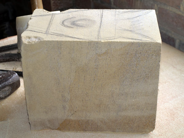
If the initial release looked like this heavy block of stone:
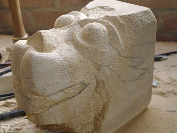
Then it has now iterated into a rough sculpture, something more like this:
Also, seeing the content prototype live, clients now fully realize their content is the backbone of everything. It helps them understand the idea behind the process.
And by now there’s also a big chance many people in the team were involved already and feel ownership in some way or another: front-end, design, copywriting, back-end… It’s a good thing.
It’s a wireframe
What I quickly realized, and found to be a very valuable side-effect, is that a content prototype is actually a wireframe. At least if you wireframe to visualize the order and importance of page elements. That’s because I have a very simple rule when coding the content prototype: the most important information of the page goes on top. The rest goes below in descending order of importance. It forces me to keep focus and make important decisions early on, purely based on content, and not on what looks good in Sketch.
It lives
From now on, there’s a push and pull between copywriting, pixel-perfect mocks and testable prototypes. Things influence each other. Design influences front-end, but front-end influences design as well. This is key. It tackles the second big pain point I struggled with before: teams operating in silos.
It’s testable
Based on the content prototype, we design mobile-first in Sketch, then add the mobile CSS to the content prototype. Every stage adds a tiny layer of fidelity and always delivers a human testable, real thing.
And that’s exactly what we did next: as soon as the mobile CSS was there, we tested the living prototype with the target audience. The tests clearly showed us usability problems that were mostly quick and easy to correct at this point in the process.
These usability tests are very important, and the last big part of the puzzle I felt we lacked in our process before. The tests allowed us to take design decisions based on feedback by the target audience, rather than our very own designer gut feeling. And that’s extremely important. At Base it’s part of our DNA: we don’t design for designers, we design for people.
Looking back
In a way, the content prototype has taught us to see design as progressive enhancement to content. And it helped us tackle three major pain points in our current design and development workflow. We’re still only halfway through the project, so it may be too soon to jump to conclusions. But as we explore, commit and refine the prototype, the confidence grows that one day we’ll have a releasable thing that feels better than anything we did before.
We’re definitely not there yet, but I’m confident we will be soon.
(Update: I’ve now published a follow-up to this post.)