Copywriting is interface design
I’ve said it before: clarity is the most important value of good user interface design. Earlier I blogged about icons and discussed UI typography. Today I’ll cover copy. Because not only the face of text in apps matters, semantics obviously do too. What good is a highly legible typeface if the text it sets conveys an unclear message?
In Getting Real, 37signals wrote:
If you think every pixel, every icon, every typeface matters, then you also need to believe every letter matters.
So true. Alas, copywriting is an often overlooked aspect of UI design. That’s a serious shortcoming, because if you come to think of it: most of an app’s user interface simply is text. Hide the icons, imagery or colors and every app or web site is basically just letters and numbers. There may be some data in there, a significant part of it is UI. It would be stupid not to take excellent care of it.
Check Photoshop’s Image Size dialog box for example. It’s mostly text. Consequently, as a user, you need to figure out how it works chiefly by reading text:
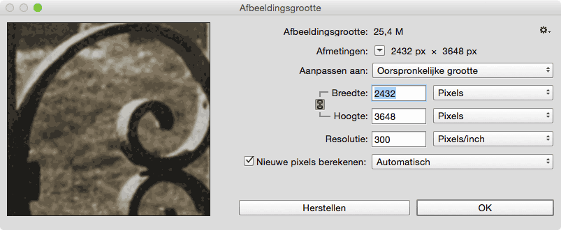
Bad copy introduces friction. Always. Users will pause and try to figure out what your writing means. That’s a bad thing, knowing that even the tiniest distraction may lead a user astray of the task at hand. On the contrary, good copy will help users fast-forward in reaching their goals.
Concise, clear copy will raise the clarity of any user interface. I can’t stress the importance of it enough. Have a look at the Nike+ iPhone app as an example. Check that button, it says Begin run. That’s what I call clear copy.
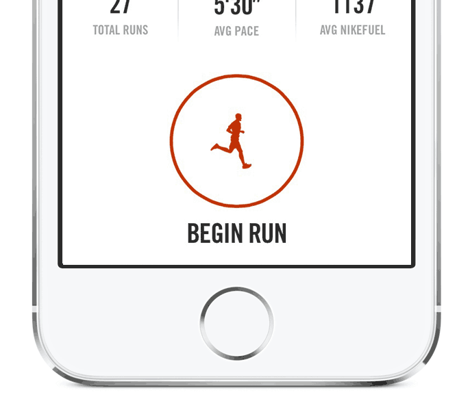
Many of us would probably have gone for Start as the button’s label. But while Start could leave room for thought, Begin run is very clear. No user will doubt what that button is for.
Twitter invites tweeting with a label that reads What’s happening?. Smart move. They could have gone for Write a new tweet but that could scare off new users (what is a tweet?) and is by far less inviting, even to experienced users.
I love Airbnb and have had excellent experiences with its service, yet I struggle to log in to their website every single time. The reason? Bad copy:
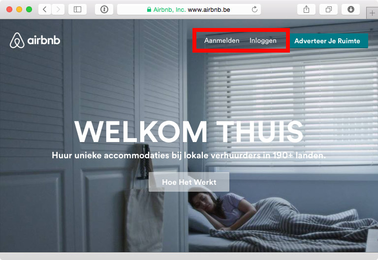
The labels for Sign up and Log in may be clear in English, they are translated into Aanmelden and Inloggen in Dutch. While there’s technically a difference in meaning, it’s two completely interchangeable words to most native speakers.
Joshua Porter once said that “The fastest way to improve your user interface it to improve the copywriting.” In the case of Airbnb’s home page, that’s most definitely true. I don’t need an icon, rounded corners, the golden ratio or a better color scheme here. Simple unambiguous writing will do.
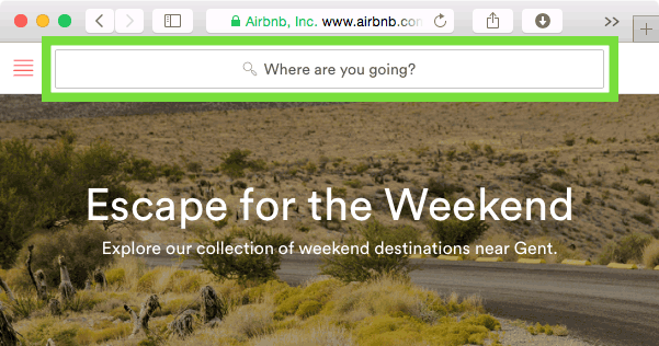
A bit deeper in the app, Airbnb is doing much better. The search field in the header has the descriptive label: Where are you going? It’s inviting and leaves less room for thought than Search would do. It’s clear what it’s meant for and above all: it’s clear what it’s not meant for. You wouldn’t look up a friend’s profile through that input field, would you?
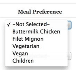
Sadly, the web is full of ambiguous copywriting. Some time ago Mariusz Ciesla made me chuckle as he shared this comment on a screenshot on Twitter:
This dropdown menu is the prime example why copywriting is interface design.
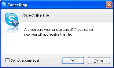
And we’ve all seen dialog boxes that look like this one from an old Skype version. It’s embarrassing and will leave users frustrated.
Enough on the bad, let’s focus on the good again. Great copy has the right tone of voice too. Just as much as consistency in visual style, consistency in tone will help designers create a more uniform and better user experience. In some cases, it makes a huge difference. Take Slack for example: in a crowded and saturated market they’re crushing all competition. Why? Part of their success is clever copywriting. It sounds consistently different.
Here’s two messages Slack once showed while data was loading.
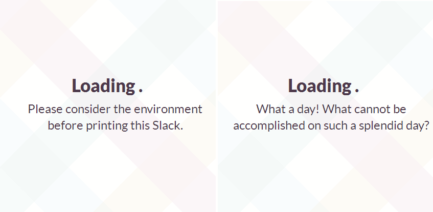
Both messages clearly manifest a different voice compared to what most apps display when digging up data. It may seem a bit off at first, yet it’s part of a greater consistency in copy throughout the app. One that feels totally right. Slack’s not just a face in the corporate crowd.
MailChimp acknowledges the importance of a consistency in voice too. They’ve even created a comprehensive guide that helps anyone who writes for MailChimp to find the right voice and tone.
As designers, I feel it’s our job to come up with good copy. Or at least provide copywriters the right clue. Writing is an essential part of design. Just as much as bad copy can ruin a good design, the right words can enforce it.
Most of us have grown used to discussing design with the developers on the team. We’ve seen it lead to better products. Nonetheless, copywriters and translators mostly reside in a galaxy far away. That’s no good. We should discuss design together, as we aim for the same objective anyway. We really should.