The best icon is a text label
Previously I wrote about clarity being the most important characteristic of a great interface. Let’s talk about icons now. They’re an essential part of many user interfaces. The thing is: more often than not, they break clarity.
Pictograms have been in use since the early days of mankind. They are often seen as the first expressions of a written language. Some non-literate cultures still use them today as their main medium of written communication.

In many public spaces, they’re used for wayfinding. Especially in a multi-cultural environment like an airport, traditional written language would not suffice.

Icons soon became popular in user interface design too. Have a look at this shot of the first commercial graphical user interface on a desktop computer (the Xerox Star). Designer David Smith invented the concept of icons and the desktop metaphor:
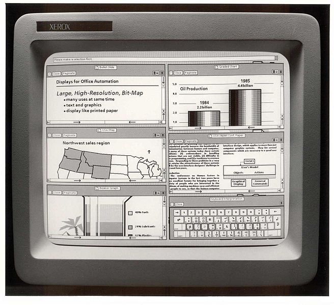
Of course I can see why icons grew popular in user interfaces. Firstly, they make the UI more graphically pleasing. And when done right, they can certainly give your app visual personality. That’s two good things.
Moreover, an icon can often replace a long descriptive group of words. As screens get smaller, this is much welcomed. But herein lies the design trap, because most icons are unclear. They make people think. What good has a beautiful interface if it’s unclear? Hence it’s simple: only use an icon if its message is a 100% clear to everyone. Never give in.
(Unclear icons remind me of this funny graphic Ron posted on Twitter recently. I guess someone got frustrated by all these unreadable washing icons…)
![]()
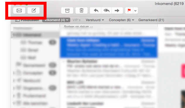
Discussing the use of icons with clients, the remark I hear often goes like this: “People will use our software daily, they’ll soon learn the meaning of our icons.” Makes sense, but I’m not sure that’s entirely correct. I use Apple mail several times a day, yet still feel uncertain which icon to click when composing a new message:
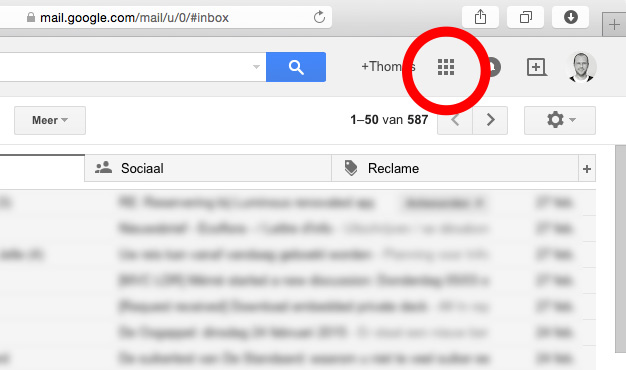
And I have more bad news: users will avoid interface elements they cannot understand. It’s in our nature to distrust the unknown. When Google decided to hide other apps behind an unclear icon in the Gmail UI, they apparently got a stream of support requests, like “Where is my Google Calendar?”
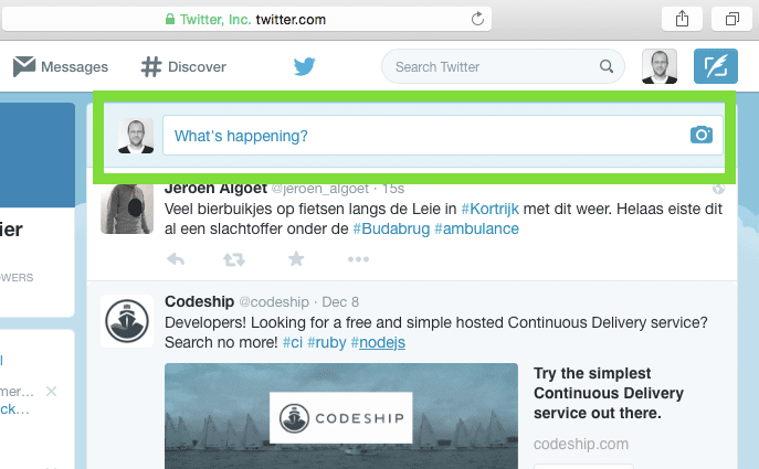
Another example: after a redesign, new Twitter users plausibly didn’t understand what they were supposed to do. The icon simply wasn’t clear enough:
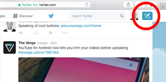
A later version made tweeting much more obvious:
Did you know you can send a direct private photo message to an Instagram friend? It’s behind this pictogram:
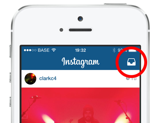
Hmmm… as an Instagram user, chances are you’ve seen it before, but have you ever used it? It’s unclear. What does it mean?
Of course context is important too when using icons. Some crystal clear pictograms get ambiguous in a different context. Watch out for that. Upon opening a Gmail email conversation, you get to see this. See how those two icons are very similar, but have a different meaning?
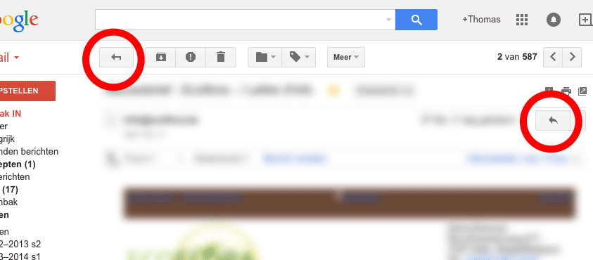
I’ve sure arrived in my inbox more than once when all I wanted to do was reply to an email. Context matters.
Tweetbot’s icons may look unclear to some of us, they are clear in the context of Twitter. Tweetbot users are Twitter users, they will recognize these so it seems okay to me to use them here:
![]()
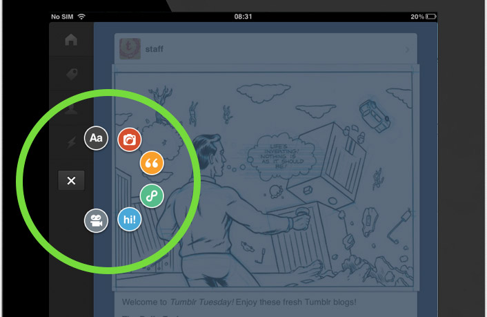
The same can be said about the Tumblr iOS app. Some of these icons may look weird to most of us, they’re pretty clear in the context of Tumblr. Its users will recognize these.
The Rdio Mac app looks like this:
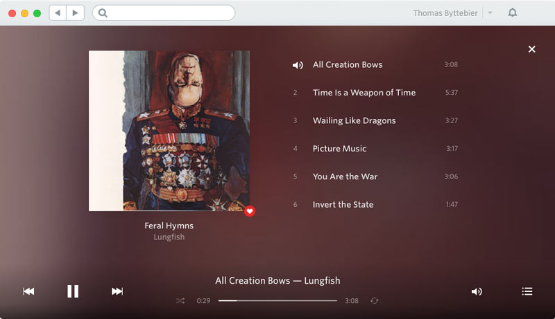
Most of the icons in use here are clear in the context of a music player. (A weird thing though is that one icon has 2 meanings: the volume and the currently played song.)
So let me repeat: don’t use an icon if its meaning isn’t a 100% clear to everyone. When in doubt, skip the icon. Reside to simple copy. A text label is always clearer.
If you want to keep the graphical advantages of icons, you can of course combine the icon with copy. It’s an excellent solution that unites the best of both worlds.
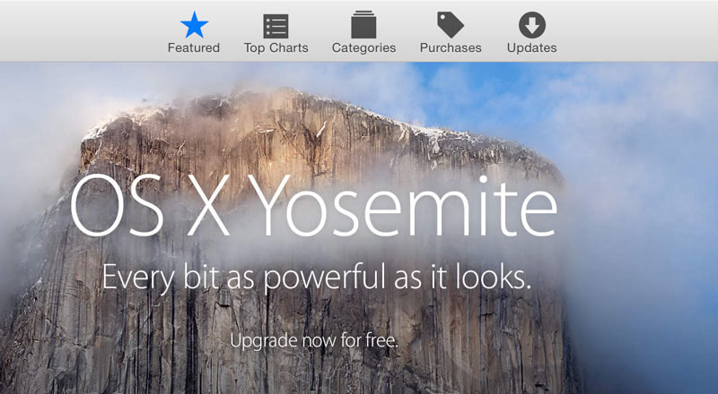
The Mac App Store is doing exactly this. It’s almost mandatory here, because the icons themselves would be totally unclear:
It’s also what Twitter is doing in their web interface:
![]()
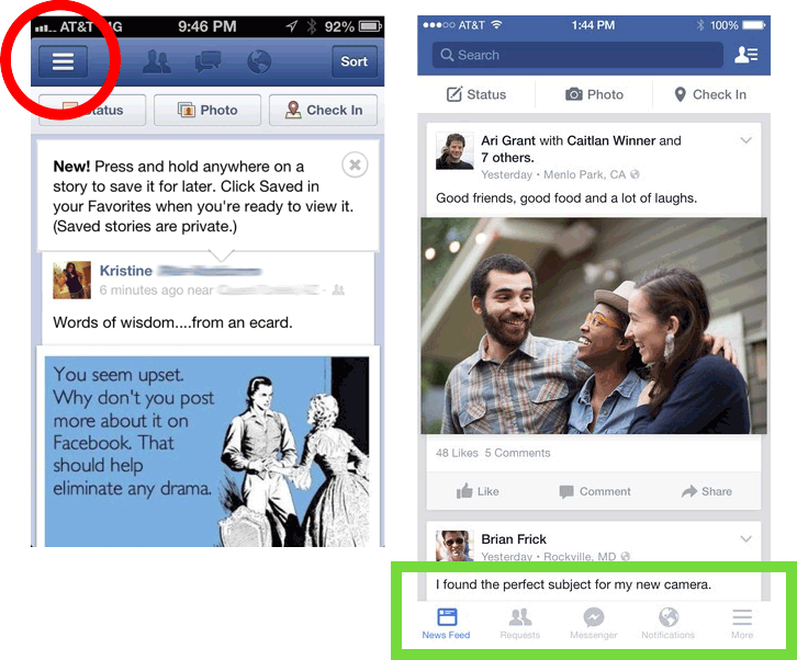
Let’s look at Facebook as a final example: they lately traded their unclear hamburger menu icon for a frictionless navigation that combines icons with clear copy. Well done:
I hope all of this made clear that icons can easily break the most important characteristic of a good user interface: clarity. So be very careful, and test! And when in doubt, always remember this: the best icon is a text label.