A clear interface is a better interface
(This is part 1 of a series of blog posts on the design characteristics of great user interfaces. It’s a more elaborate take on what I discussed earlier.)
Clarity is probably the first and most important characteristic of good user interface design. A clear interface is simply a better interface. I don’t think anyone will argue with that.
In the 1930s and 1940s, American industrial designer Henry Dreyfuss dramatically improved the look, feel and usability of dozens of consumer products. You may recognize his telephone design for Western Electric:

Dreyfuss was not a stylist, he applied common sense and a scientific approach to design problems. Ergonomics and ease of use were much more important than style. In 1955 he said:
When the point of contact between the product and the people becomes a point of friction, then the designer has failed. On the other hand, if people are made safer, more comfortable, more eager to purchase, more efficient — or just plain happier — by contact with the product, then the designer has succeeded.
In the context of user interface design, I think it’s safe to say the interface itself is the point of contact between the app and the user. And that’s why today, 60 years later, Henry Dreyfuss’ quote is still highly relevant.
If your app isn’t clear enough, users will struggle. There’s going to be that point of friction.
In more recent times, usability expert Steve Krug basically said the same. His book Don’t Make Me Think made an enormous impact on how I design web sites and interfaces.
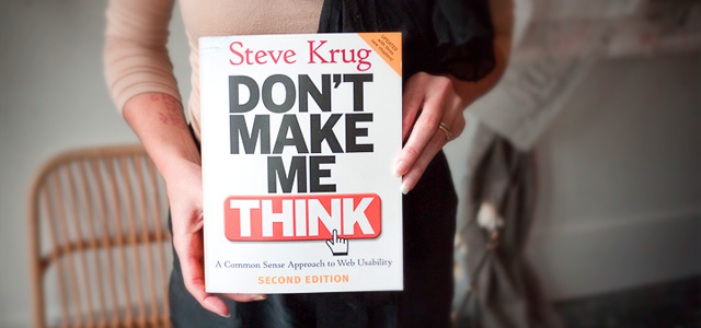
While the examples in the book may be a bit outdated, the message of it still stands strong: don’t make your users think.
If your users don’t know how your app works, they’ll become frustrated. Or in the words of Henry Dreyfuss: there’s a point of friction. If I can’t instantly figure out how to download new messages in your email app, you’re making me think and there’s a point of friction. If I can’t directly find the navigation item that leads me to your restaurant’s opening hours, you made me think. If I don’t instantly see how to contact you, there’s friction…
A lot of times applying common sense is the clearest and best design solution to a UI question. But introducing clarity in an interface by applying common sense is not always an easy thing to do. The solution that makes most sense to you may not make most sense to your user. Things that look obvious to you, may look odd to the user. And the complexer the situation in which someone uses the app, the harder things get. That’s why it’s extremely important to get to know your user first. (We’ll talk more about that later.)
Here’s what Steve Krug says on the matter:
There are no simple ‘right’ answers for most web design questions (at least not for the important ones). What works is good, integrated design that fills a need—carefully thought out, well executed, and tested.
That last word is important here. Clarity in UI design can be tested. You can hire folks to do the testing for you, or you can do it yourself. Steve Krug showed me how simple a usability test can be in his book Rocket Surgery Made Easy. If this interests you, make sure to watch his demo video of a website usability test.
Anyway, we’re drifting off a bit, let’s have a look at a simple but crystal-clear interface, Messages on iOS:
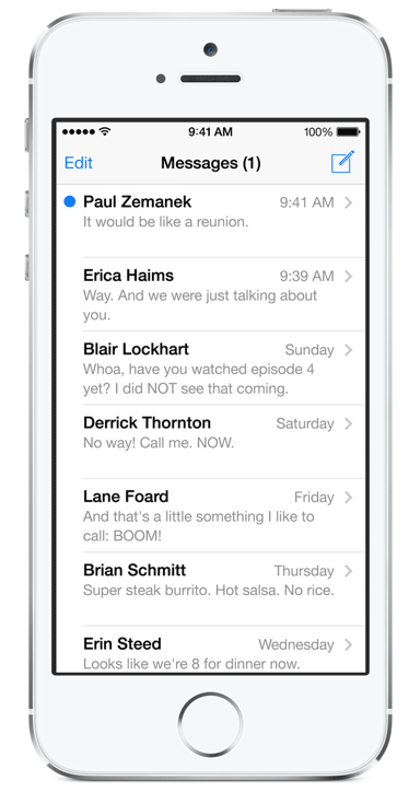
There’s really not much to think about when using this interface. It’s instantly clear there’s one new message, who it’s from and when it was received. I don’t have to think about how to open a message or how to compose a new message. No friction, this is excellent design.
WhatTheFont is an app by MyFonts. It lets users upload a photo, then identifies the typeface visible on the picture. While there’s arguably a lot to improve graphically, the startup screen is very clear:
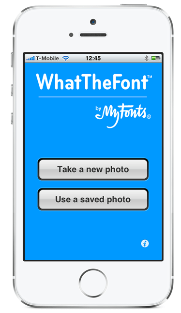
Everybody happy.
This app by De Lijn, a Belgian public transportation service, is clear and attractive. It has good filled-out defaults (current location and time) and an intuitive design. That makes it a nice to use interface at this point:
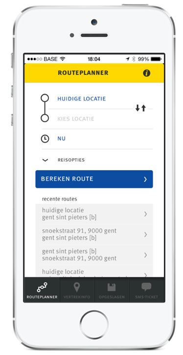
One way to make an interface clearer is to add descriptive help messages. While that may look like the obvious thing to do, it can soon get distracting and simply get in the way, making your interface less effective. That’s why balance is so important in the design of user interfaces.
Dropbox and Things are two apps that have a smart way of dealing with this: they show explanatory text, but only to users that haven’t used a particular feature of their app. Instead of showing help messages all over, they use the opportunity of the empty screen to explain their users the benefits of that unused part of the app.
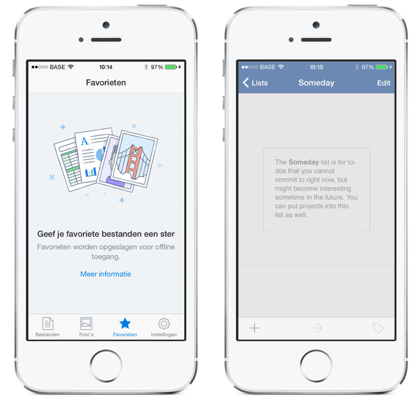
Probably interesting to refer to here is the influential blogpost Basecamp wrote on their Signal vs Noise blog over a decade (!) ago. It’s all about this so-called blank slate of web apps.
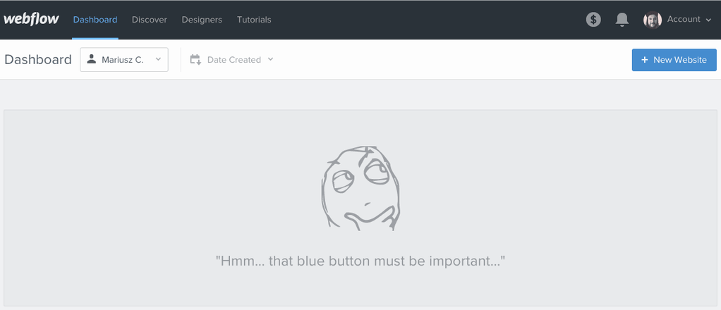
Webflow does things more lightly in their blank slates, adding a bit more clarity and a lot more personality to their user interface:
Let’s have a look at one last example, the Wordpress CMS admin section:
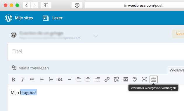
While the icons in itself aren’t clear enough and possibly introducing friction, Wordpress uses descriptive help messages when hovering over the unclear icons. I guess it’s an acceptable way to introduce more clarity to this area of the app.
So, to wrap up, what I basically wanted to say is this: good interface design is like tightrope walking. It’s all about finding the right balance. There’s dozens of things we have to look out for as designers, but clarity is undoubtedly the most important one.