Usability testing the new MoMu website
At Base, for website projects, we do all kinds of informal usability tests. The most complete test is the one we do around launch date. In a simple setting, we invite people that match the target audiences and give them a set of tasks to perform on the real website. The tasks are directly derived from project goals.
It’s an exciting (and often humbling) moment. This close to launch date, there is no excuses anymore: the information architecture is all set, the content is in the right place and the design has fully shaped in development. As a result, the insights we get from these tests are immense.
To give you an idea, here’s five remarkable things we learned from testing the website we designed for Antwerp’s fashion museum MoMu. We launched it earlier this year.
1. Hiding navigation is totally ok
Early in the design phase we decided to hide the navigation behind a Menu button. Of course we had our reasons from a functional and visual point of view. But usability wise, it was a pretty risky move we didn’t want to take lightly.
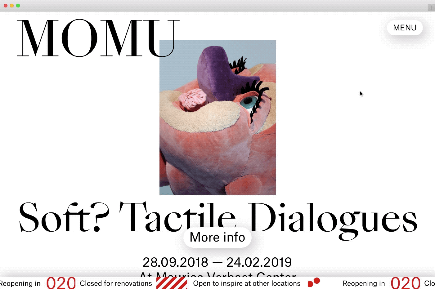
Quite surprisingly, the test of the navigation system didn’t indicate a single problem. All testers were confident to use and quick to understand where to find the menu. Phew!
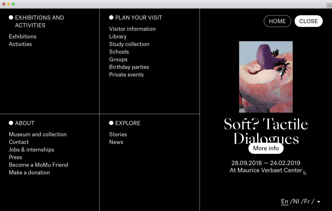
2. Don’t assume everyone is aware of hidden navigation patterns
We did notice one particular navigation problem though we hadn’t anticipated. During the test, a significant amount of people wanted to navigate back to the home page every now and then. However, they couldn’t figure out how. As there was no Back to home button on any page, they always tried the menu:

But as you can see, there was no Back to home option there either! Some started to do all sorts of crazy tricks, like clicking the browser’s back button a dozen times, or manually editing the url in the browser’s address bar. Whatever they tried, they clearly suffered and that was no good.
Ouch! Problem. Now what?
Our solution was pretty obvious: we added a clearly visible Home button on the menu screen. It was an effortless change that had a massive impact right away. Testing the new iteration revealed 100% of testers could now easily navigate back to the home page of the website.

Mission accomplished. But how could we have been so naive? How could we have left this out of the initial design?
The answer is that we falsely assumed people would click the top left logo to return to the home page. We believed this to be a well-known navigation pattern. But we were wrong. This test showed that only about 50% of our testers relied on the logo to navigate back to the home page. Especially older people seemed not to be aware of this.
(On a sidenote: our assumption was fueled by the results of a previous test in which all people did click the logo to go back to the home page. Strange? Maybe. Above all it shows that every project is different.)
3. Clicking a link means clicking a link
As the website is fully available in three languages (Dutch, French and English) and partly available in one language (German), we make sure most people will instantly see the website in their preferred language. This diminishes the importance of the language switcher and made us decide to move it away from the typical top right corner, and to position it inside the navigation screen.
However, there is still the rare occasion in which a visitor could see the interface in a language she doesn’t understand. And so we wanted to test the non-standard position of the language switcher.
Although we couldn’t test with foreign language speakers, we did learn Dutch speaking people didn’t have trouble finding and using the language switcher (we asked to switch to German, which is buried even deeper in the interface). That was good.

What we did notice though, is that in some specific cases people wanted to click a navigation item as the fly-out language switcher panel was still open. This didn’t work. We had programmed it so that clicking anywhere outside the panel would close the panel instead. It made sense to us at the time, but it clearly confused some people.
We decided to push a quick fix that solved the issue: clicking anywhere outside the panel still closes it, but clicking a link outside the panel always just follows the link, regardless of whether the panel is open or closed.
That’s a win! Here’s a quick demo showing this scenario:
4. Newsletter subscription on the home page
We figured having a newsletter subscription option at the bottom of the home page would suffice.
But when we asked people the direct question to subscribe, we saw they looked in various other places. A tiny minority looked for it on the home page, but almost everyone else searched for it on either the contact page or the news page.
Of course, if you think about it, that makes total sense. But it was only by seeing people struggle that we fully realized this. Lucky for us, the solution was very quick to implement again: we just added the newsletter subscription module below the content of these pages and tested again. It solved the problem instantly.
5. You always need content edits
This is the last point in this article, but it’s probably the most important one. Throughout the test day, we learned that a lot of improvements could be made in the content itself: in the way certain messages were phrased, how the label of buttons appeared misleading, and how microcopy in specialized language wasn’t always clear enough.
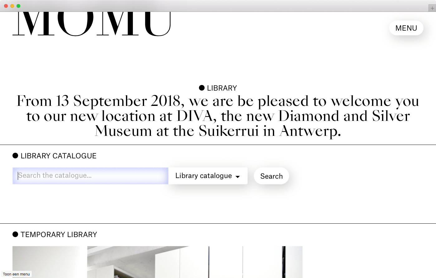
To give but one example: somewhere on the website, people can search MoMu’s library catalogue. During the test we used “Find a book…” as a placeholder in the form field. It confused some people. We replaced it with “Search the catalogue…” which performed better immediately as now the placeholder helps make clear exactly what the form field is for.
Insights similar to these led to dozens of small copy and content improvements that had a huge impact on the overall website usability and understanding of its content and message.
What if we hadn’t tested?
As most of us look at anonymous visitor statistics most of the time, testing with real people brings a human face and deeper understanding to the issues at hand. It builds empathy. Seeing people struggle navigating a website you designed is the best way to understand how to make it better. But it similarly raises the question: what if we hadn’t tested?
I think it’s fair to answer by saying that monthly, without anyone knowing, thousands of people would have suffered from exactly the same usability problems. Unnecessary and pointless.