Enhancing a physical exhibition through digital
Initiated by baron Léon Lambert in the 1960s, the ING Belgium collection today counts approximately 2500 works of art. About six months ago, the bank addressed Base Design with its plans to publicly show part of the collection in Brussels. We were tasked with creating the concept and visual identity, as well as designing the physical space for the exhibition.
Early on, we decided to create a digital companion to the physical exhibition to enhance the visitor experience. From the outset we set ourselves three objectives for this digital tool:
- It had to give on-site visitors additional context to the artwork inside the exhibition.
- It had to be easy to access and use on-site.
- It had to provide an experience that is linked to the concept of the exhibition.
Before we started, we looked at the digital tools that museums and galleries were already using, to see what we could learn from them. We quickly realized that there has been a lot of experimentation, but no standardization nor a consensus on what is the best approach.
The state of digital visitor tools in museums
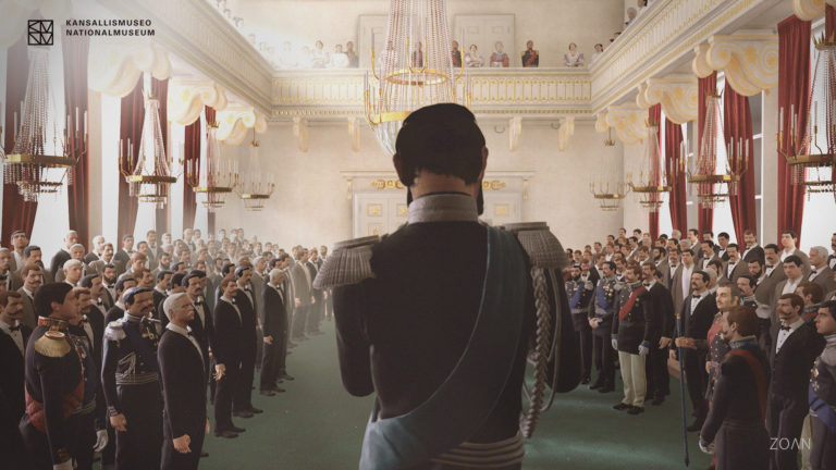
Several museums have experimented with VR and AR tours. The Kremer Museum is arguably the most extreme example as it only exists in virtual reality. In 2017, Tate Modern very interestingly recreated the Parisian studio of Modigliani in VR. The National Museum of Finland came up with another take in 2018, allowing visitors to walk inside R. W. Ekman’s painting, “The Opening of the Diet 1863 by Alexander II” (image below).
VR is fascinating, but costly to produce and it requires visitors to use additional hardware. Impossible in our case.
Looking further, we were charmed by Serpentine Galleries’ approach (image below). A few years ago, they debuted their Mobile Tours: as visitors connected their mobile devices to the on-site wifi, the browser would fire up and offer access to additional content – artist interviews, editorials, and curatorial tours.
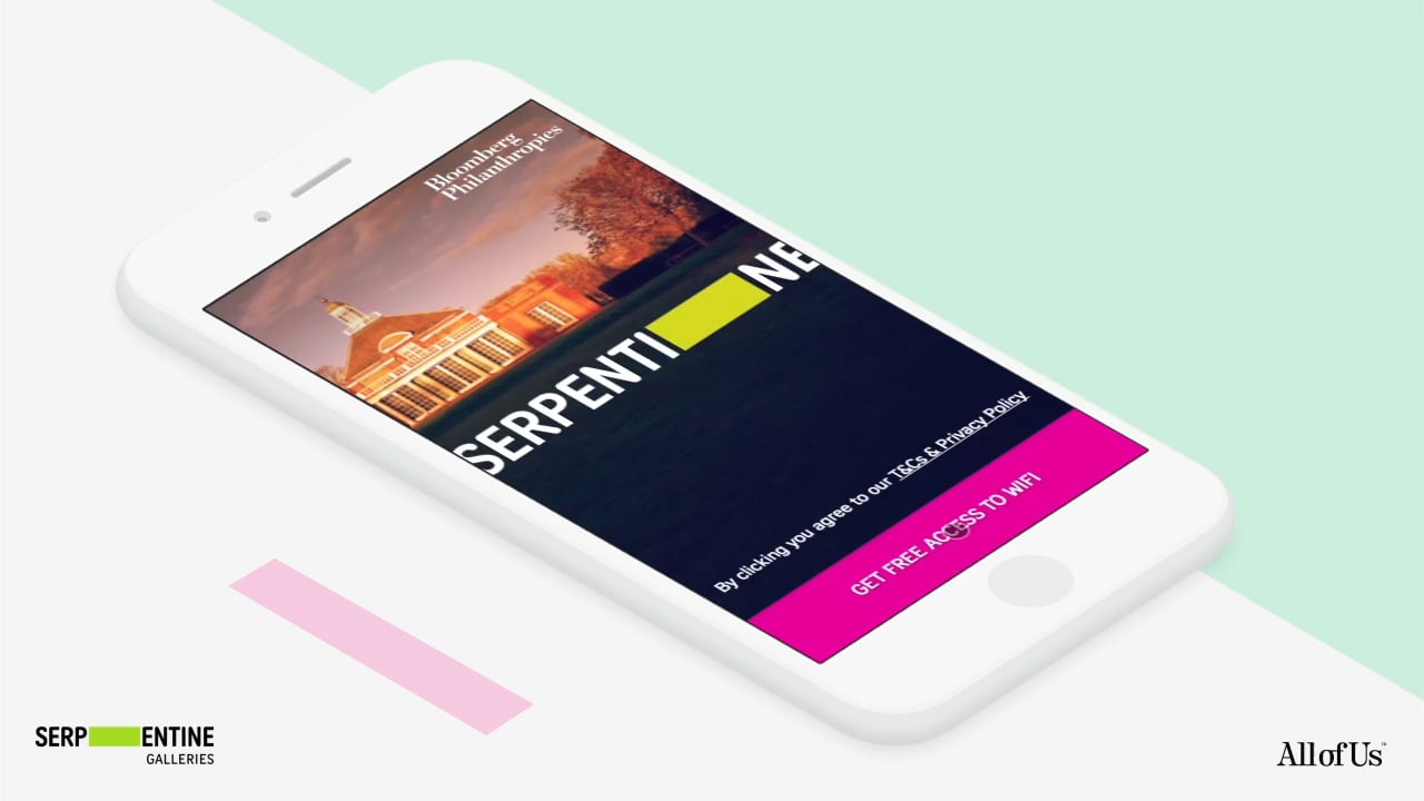
We very much liked the Bring Your Own Device idea in this setup: no special hardware was required, visitors could access the Mobile Tours via wifi on their own smartphones.
Although the Serpentine Galleries app looks good from a visual design standpoint, a downside was the rather complex way of navigating inside the app. I recalled using it a few years ago, and being left frustrated.
Another interesting take on digital visitor tools came from the Hirshhorn Museum. They created the Hirshhorn Eye (in short called Hi), a native mobile app that allows visitors to scan works of art as they wander through the galleries. Upon scanning, a video of the artist appears, giving more context about the piece of art. Here’s what that looks like:

The Städel app used to offer a similar approach of scanning a work of art to access additional content on your phone.
What we liked about these apps is that they solve an ongoing issue gracefully: scanning allows people to find their way directly to the piece of art they are currently interested in. I haven’t tried it myself yet, but if it works exactly as advertised, it’s a clear and intuitive mechanism.
We learned that other museums have experimented in different ways to solve the same issue. Some use location aware features such as GPS tracking, beacons, wifi access point detection… Nice, but often pretty hard to set up, costly, and in our case, not worth the effort for a one time exhibition.
Expensive, overwhelming, numbing
While each of these approaches has their strengths and weaknesses, it was clear that none of them would work for the scenario we were facing. The main drawbacks were the production cost, poor accessibility, and often poor usability, with most offering far more content than any visitor could actually handle in a single visit.
Additional visitor research taught us a few interesting facts that we wanted to take into account:
- People don’t download apps anymore. They especially don’t want to go through the hassle if it’s to “possibly” enhance a one time gallery visit. When was the last time you downloaded an app?
- People don’t want to go through the mental effort of getting to grips with crazy new interfaces as they wander around a gallery. There is already so much to figure out: the layout of the space, the artwork, understanding the labels, the interaction with the other visitors…
- And linked to that – people can only take in so much information at any given time. We don’t want to overwhelm them with even more particulars: extensive video fragments, audio clips, images, additional text to read… At some point it just becomes too much.
All of this led us to believe that there had to be a simpler way for digital to enhance the physical visit without overtaking it. A very powerful emotional connection takes place when face-to-face with certain works of art. We didn’t want to numb that feeling by requiring visitors to stare at their phone screens out of a fear of missing out.
Back to basics: audio only
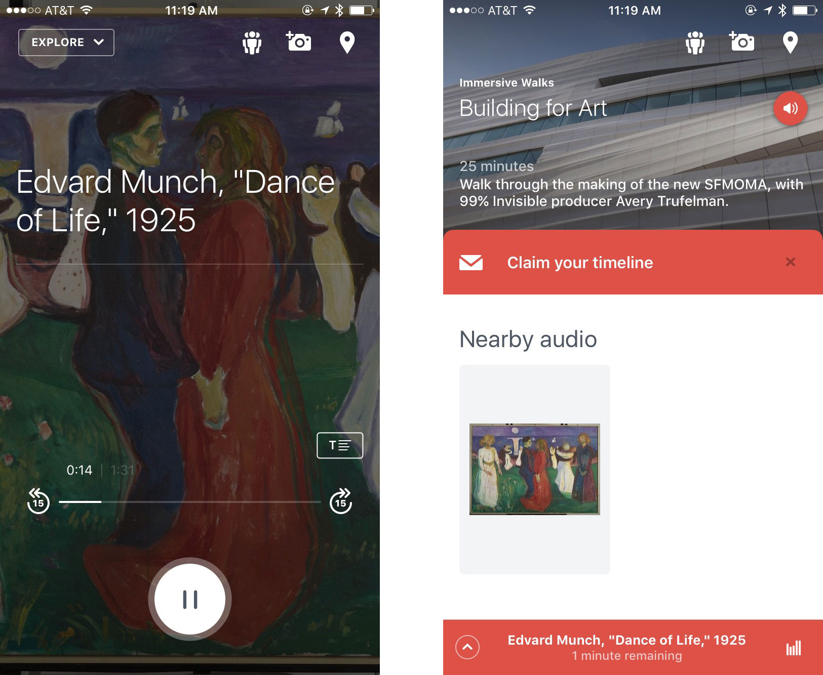
And so we dug deeper. We loved the simple audio-only approach by MOMA and SF MOMA’s mobile apps: returning to the very concept of an audio guide felt right. No distracting video, no additional images, no exhaustive supplementary long-reads… An audio guide allows visitors to fully focus their eyes on the artwork, dim their phone screens, and just listen to a short audio snippet to get more context.
Here’s screens showing the interface of SF MOMA’s audio app:
In our case, ING could provide earphones at the entrance. Or not. We tested and figured it wouldn’t be a problem if people wandered around the gallery with their phone’s speakers on. As long as they didn’t max the volume, it wouldn’t disturb the other visitors. Most people would probably hold the phone to their ears anyway, just like they would if they were on a phone call.
However, in the cases of MOMA and SF MOMA, people still have to download native apps through the App Store or Google Play Store. We didn’t want to go there: even if we designed the best app ever, we weren’t sure if people would go to the trouble of downloading it.
The beauty of a Progressive Web App (PWA)
And so, following a super interesting example by the Whitney, we came up with an audio guide that exists as a Progressive Web App (PWA). A PWA is basically a website that adopts app-like behavior by using forthcoming technologies. Here’s what it looks like:
The big advantage of a PWA is that people don’t need to download an app through the App Store anymore, they can just access the web app using the default browser on their phones.
A PWA is also relatively easy to build, maintain, and update as it’s essentially an optimized website that could run on any CMS. (For a museum, this means it could run on the same CMS that powers their website, reusing assets, the collection database etc.)
Accessibility
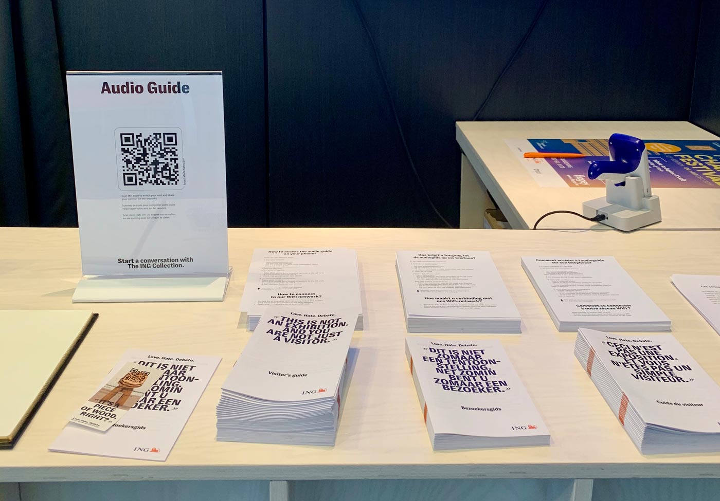
Our audio guide could be an amazing enhancement of the visitor experience, but if no one knows about it, it obviously serves no purpose.
That’s why we put it on its own domain and advertise the url as much as possible at the entrance of the exhibition, explaining that it’s an audio guide. We show it on screens behind the ticket counter, on the ticket slip, and in the visitor guide. There’s also a dedicated one-sheet that explains to non-tech-savvy visitors how to access the audio guide.
The return of QR codes
A PWA has an additional advantage: since it’s available on a unique url, you can make use of QR codes to point visitors to the web app.
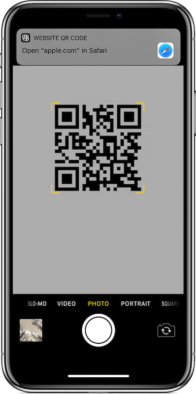
A QR code is a peculiar thing which I honestly used to avoid as much as possible. It used to be an ugly and clumsy way of linking the physical to a webpage: people needed to install a QR scanning app to be able to use them.
However, recent versions of iOS and Android have a QR scanner built in. You can simply point your phone’s camera at the QR code, and your phone will ask you to visit the associated url automatically (see picture below). There’s no need to install a third-party app anymore. That makes QR codes actually quite handy nowadays.
Additionally, even if people don’t use them, the simple presence of a QR code in print is already communicating the fact that there is extra content online. That’s helpful.
And so in addition to the printed url, we added scannable QR codes as much as possible: on the welcome screens, on the walls, on the ticket slip, in the visitor guide…
Analyzing scanning behavior
A bonus feature of QR codes is that you can track their usage. By hooking the QR code reference to Analytics, we can see how many people scan the codes, and where they perform best. This data can help us improve the visitor experience at upcoming exhibitions.
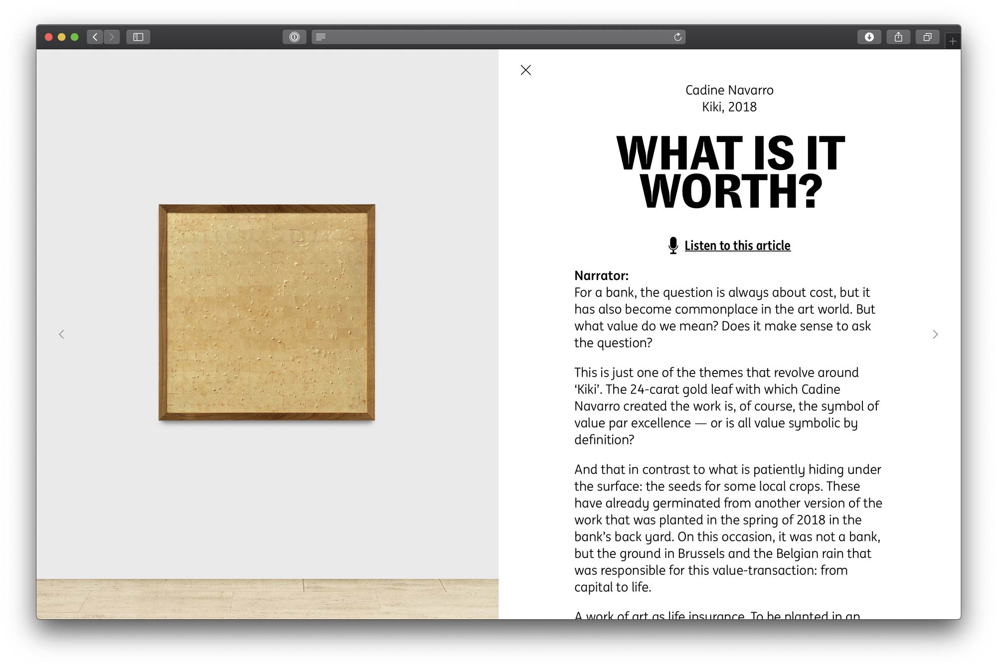
Scanning artworks
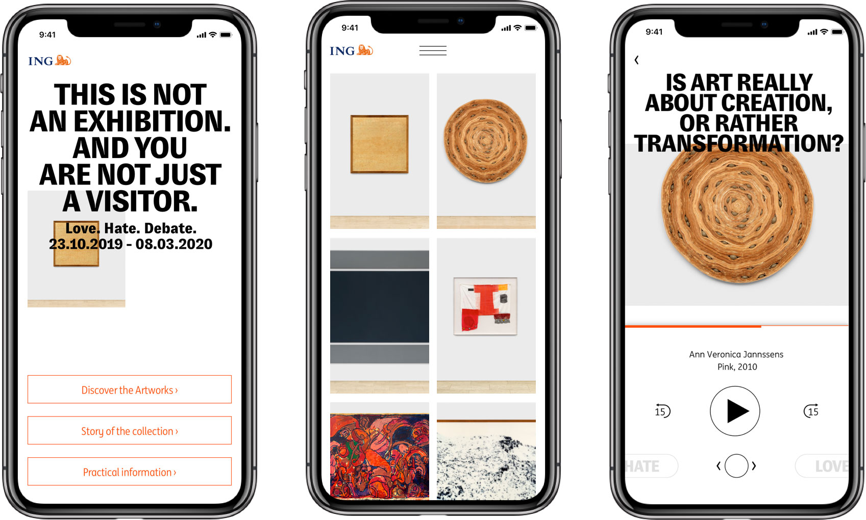
All QR codes at the entrance and in the visitor guide link visitors to the home page of the audio guide PWA. Most people understand how to use the audio guide from that point onwards. On the artwork overview screen (the middle screen in the mockups below), we made a deliberate decision to show the artwork only: no distracting artist names, titles, or additional metadata. As the visitor comes face-to-face with each work of art in the gallery, the photos on the webpage prove simple enough for visitors to quickly open the right artwork on the app.
Additionally, in the exhibition, every artwork has a clear label attached to the nearest wall with the artist’s name, the title, and a few lines of contextual information. On that label, we printed a scannable QR code that leads directly to the audio content for that specific artwork.
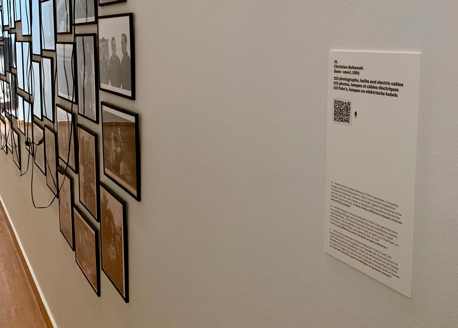
You can see an exhibit label in more detail in the picture below. As you may see we also printed a question on it, directly related to the artwork at hand and opening a debate with the visitor:
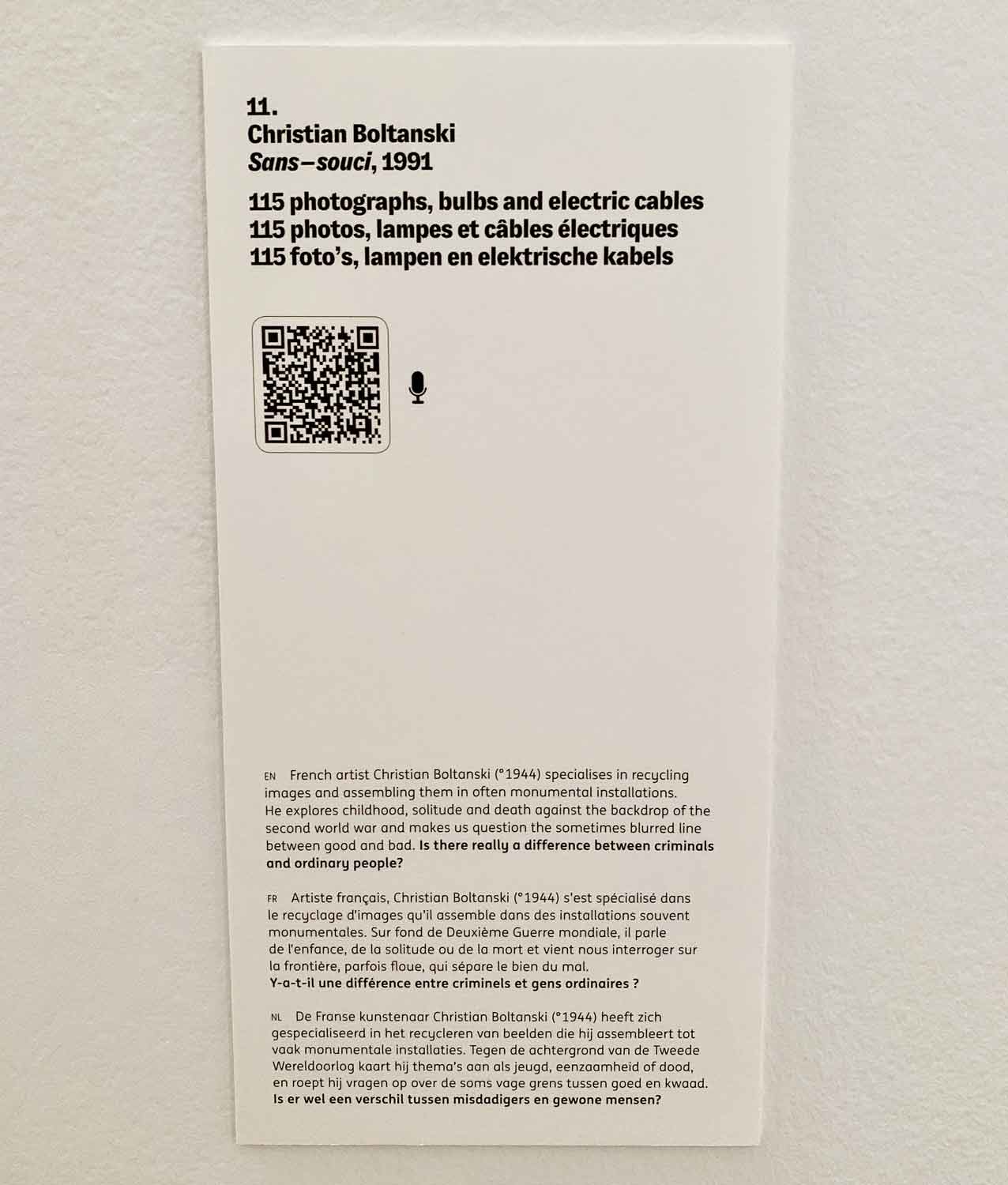
The audio guide for this artwork repeats this question word-for-word, creating a direct link between the physical and the digital.
Bonus: also available off-site
While the focus of the audio guide is obviously on enhancing the physical visitor experience, we also ensured that the guide is publicly accessible. This means that anyone can visit the PWA, even on a desktop computer far away from the exhibition.
A few simple dev tricks made sure that the app is still interesting in this case: we made the design scale for bigger screens, diminished the focus on the audio in favor of the written transcript, and we show larger photos of the artwork (as we assume in this case you are not face-to-face with the art).
Linking the app experience to the concept of the exhibition
The title of the exhibition is Love. Hate. Debate. As I explained, the question on the exhibit labels that gets repeated in the audio guide is directly linked to this exhibition title.
But we even go a step further in the app: at the bottom of each page, visitors can vote for whether they love or hate the artwork in a very simple and playful, almost Tinder-like way. After casting their votes, we invite them to join the debate on Instagram.
Here’s a quick video mockup of that interaction:
Gathering feedback
The Love. Hate. Debate. exhibition opened on October 23rd 2019 and runs until March 15th 2020. As analytics and feedback come in, we’re keeping an eye on what we can improve in a future update of the audio guide web app.
If you’re in Brussels, make sure to pay the exhibition a visit.
(Concept, design and development by Base Design. Thanks to Emily Daly for the generous help in the final editing of this article.)