Beyond the interface
In his article titled UX global trends might be narrowing our minds, author Alejandro Masferrer writes that especially in digital, everything is starting to look the same. Every interface looks similar.
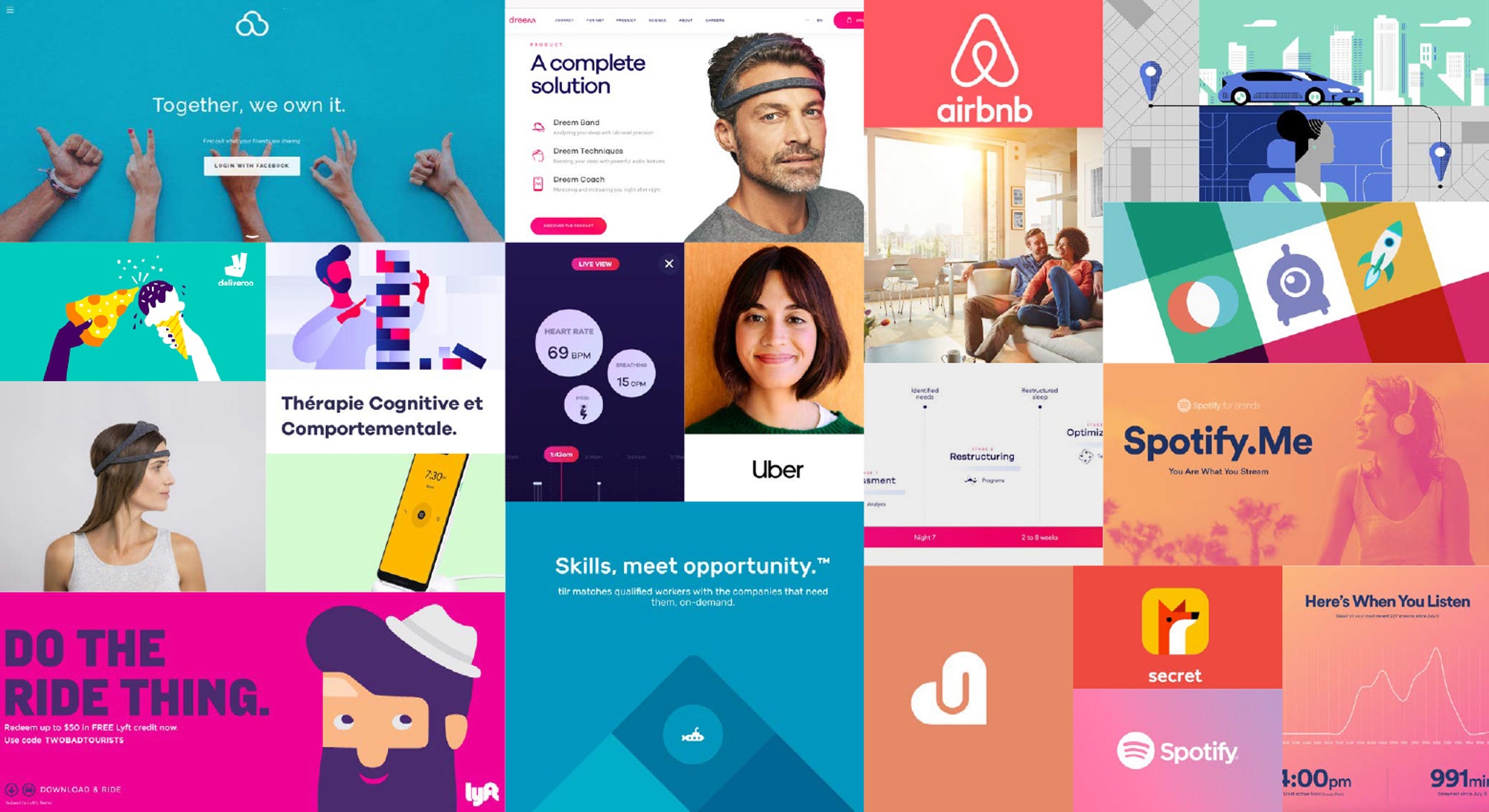
Alejandro is right. Have a look at some of the most popular apps of today:
They essentially all look the same: bold type for titles, pure line icons for navigation, full black-and-white UI, circular avatars… It’s like they are all apps under the same brand. Alejandro interestingly calls this phenomenon sameness.
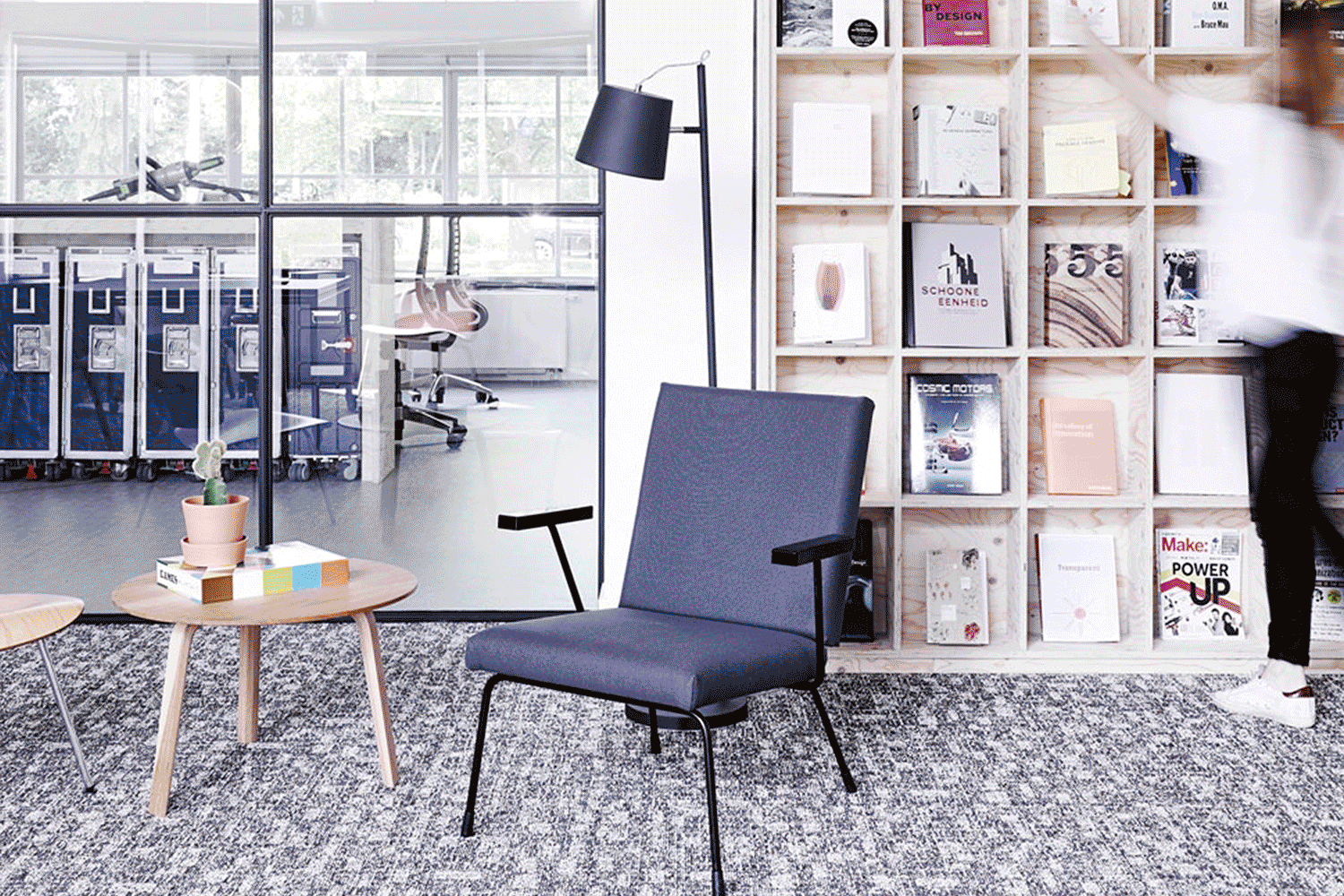
Sameness clearly appears in more areas than just user interface design. It’s happening in all creative disciplines. To give an example: the apps displayed before were probably designed in studios that look similar to the ones pictured below.
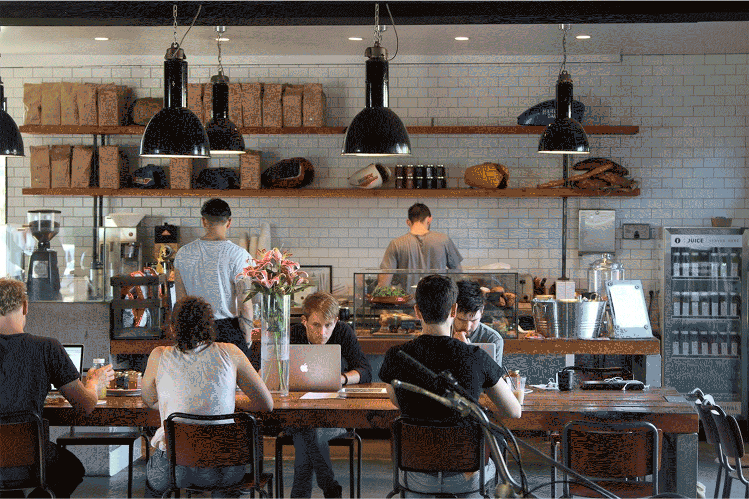
There is a reasonable chance that if you’re reading this, you work in an office that breathes the same vibe. And if you had coffee outdoors today, you may have sipped it in a shop that looks very much like this:
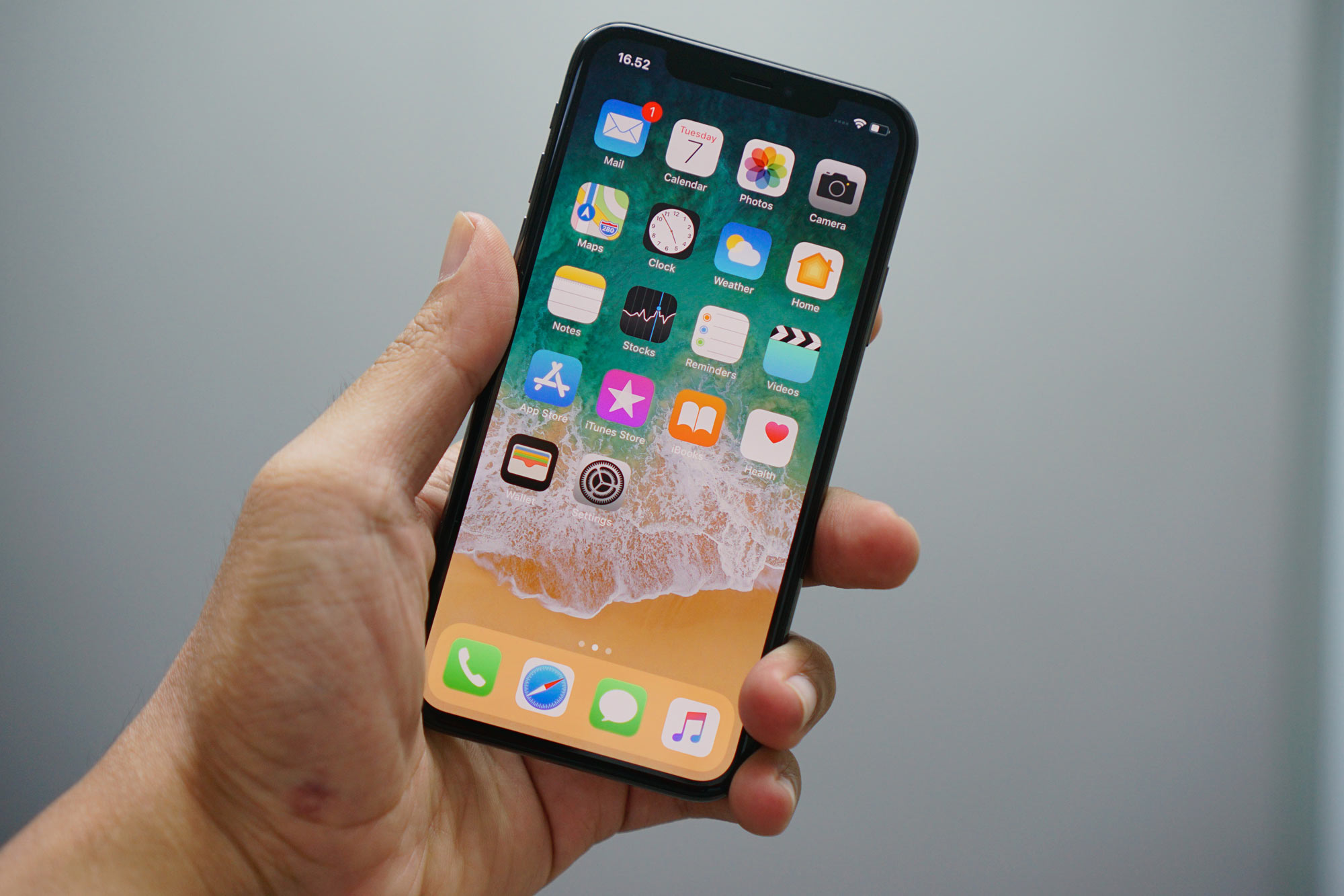
Chances are high that you have a phone in your pocket that looks similar to this one:
Hell, if you visit your local supermarket, you’ll realize even salad packaging all looks the same nowadays.
Why is everything looking the same?
What is going on here? Why is this happening? Why is everything looking exactly the same nowadays?
Part of the reason lies in the fact that creativity has always been shaped and framed by constraints. Contrary to popular belief, there is no such thing as free creativity. It is a myth.
There are basically four kinds of constraints that shape our creativity. They kick in as soon as we are trying to solve a creative problem. They are inherently part of the design process.
The first set of constraints are defined by our personality and character. It is the education we got, our personal background, our habits… As an example, consider a designer that has been working successfully for decades using only five typefaces. Of course this personal history will influence his next design job.
The second set of constraints are the ones that are imposed upon us. It’s the task’s briefing, but obviously also the timeframe and the budget we have been allocated. It’s only normal that spending 3 weeks on a creative brief will yield different results than doing the same job in only 3 days.
The third type of constraints is the ones we decide ourselves as a creative. When we are trying to solve a problem, early on we will decide on a certain approach, a format, medium and a style. This will have an impact on the final result: designing a printed poster requires a different approach than creating a website or a logo.
The last set of constraints are the ones that come from the outside world: language, trends, available technology, rules of society… As an example: today you could think about designing with VR in the browser, while years ago that was just technically impossible.
All those constraints set a certain frame. Your creativity must happen right in there.

Most of us will answer the problem right in the middle of the frame, because that is where you address the needs perfectly. Your solution will be accurate, but not challenging.
Some of us will probably try to challenge the constraints and provide an answer that is nowhere near the frame. It may feel extremely creative but it won’t address the needs very well. It’s going to be a bad solution.

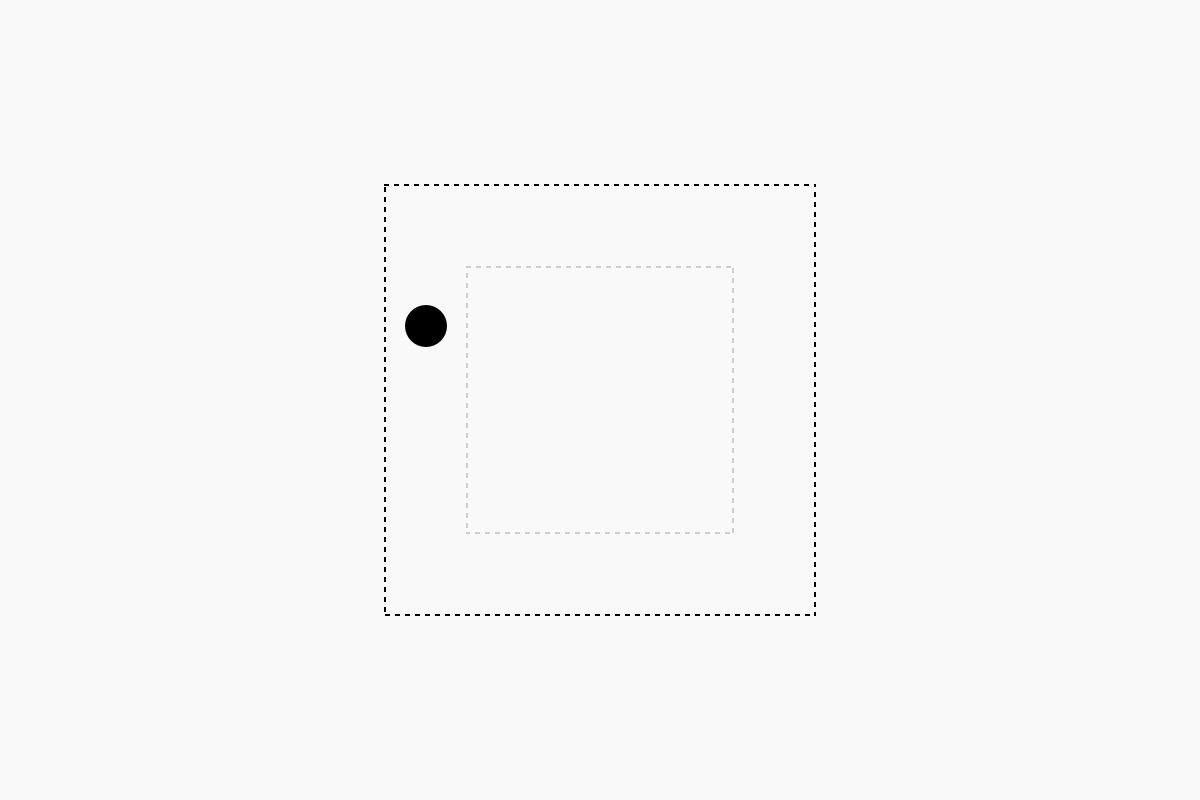
Very few of us will answer right next to the frame. Close enough to be relevant, yet far enough to challenge the constraints.
Now this is where things get super interesting. Because by doing this, we potentially reset the frame of constraints.
Before 1933, subway maps were relatively hard to read because designers always drew them on an accurate geographical map. It seemed the logical thing to do. Here’s an example of the London Underground map as it existed in 1908:

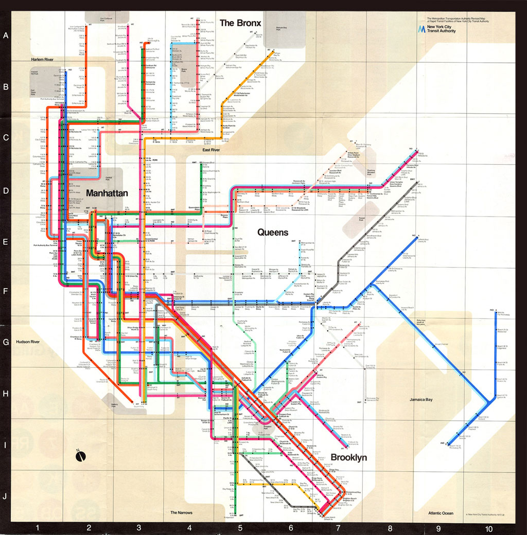
After the thirties however, subway maps of major cities worldwide started to look much clearer. That is because they didn’t try to be 100% geographically accurate anymore. As an example, have a look at the NYC subway map Vignelli designed in 1972:
What happened in the thirties? Harry Beck. Beck brilliantly designed a new kind of map for the London Underground. First introduced in 1933, the map focuses on what matters most to people using the Underground: the tube lines, stops and exchanges. Beck also added the river Thames to the map, an important point of recognition for most Londoners.

What is interesting about the 1933 map is that it distorts the train lines, relying only on horizontal, vertical and perfectly diagonal lines. Stops are spaced similarly as well, while in reality the distances vary greatly.
Beck’s solution to the problem at hand was right next to the frame of constraints of that time. Yet it has proven very appropriate and it remained virtually intact for over 80 years, with only minor updates. Its brilliance lies in what it doesn’t show: streets, buildings, curves in lines, and actual distances between stops. This approach declutters the map and makes it more usable for most travelers.
Harry Beck reset the subway map’s frame of constraints ever since.
Let’s fast forward to 2010 for another example, redefining web design. Less than 3 years before, Apple had released its first iPhone. Smartphone adoption rates went crazy and soon it was common for people to surf the web on tiny screens.
Brands had to adapt to this new type of user. Some created standalone iOS and Android apps that were basically a mobile version of their website, others created a new and dedicated mobile version of their existing website. Whatever solution they opted for, it meant content duplication and additional development costs. It was a dreadful situation.
But in 2010, using a combination of forthcoming technologies, Ethan Marcotte found a brilliant solution to the problem. He developed a simple approach that allowed designers to make the same website look great on all kinds of devices: from small smartphone touch screens to large desktop screens. He coined the term responsive web design.
In 2011 Marcotte and his team designed and developed The Boston Globe, the first real content-heavy responsive website.
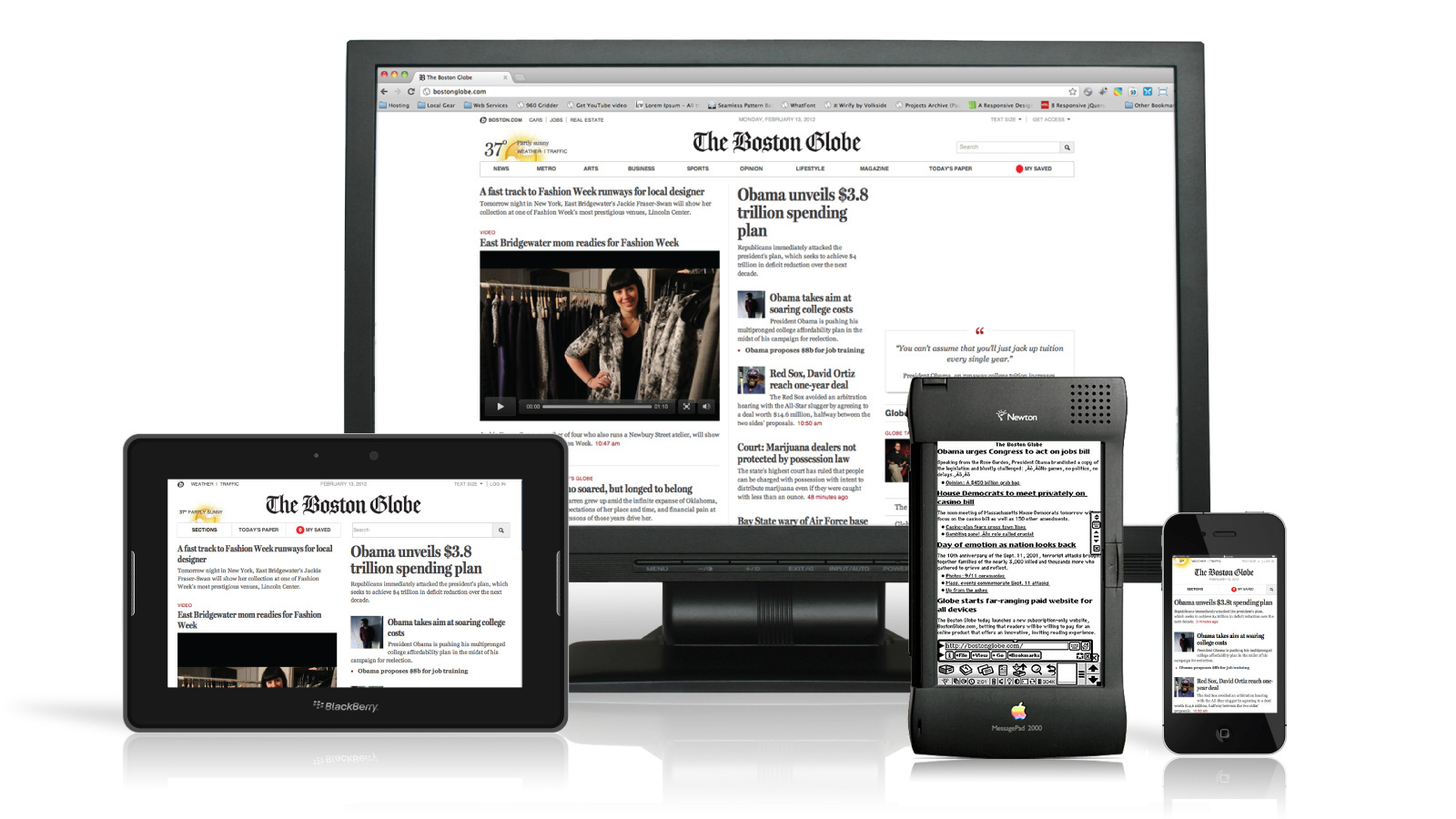
Because their solution was so accurate, they reshaped the constraints of designing a website forever since. They upped the game. Subsequently, after 2010, all new websites were designed responsively.
Globalized design makes great ideas travel fast
Globalization in design ensures that good ideas like Beck’s subway map or Marcotte’s responsive design concepts, spread super fast. Today, all of us have access to the same cultural references at the same time, wherever we are in the world. That is of course a good thing.
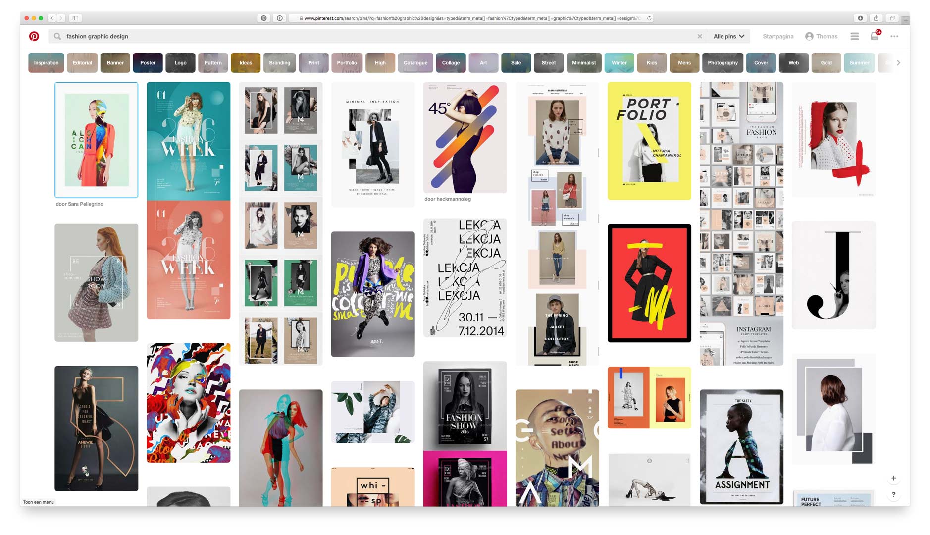
But if we all read the same blogs, and look for inspiration using the same search terms and exactly the same tools, then it’s only natural we somehow end up finding similar solutions.
Globalization has created a nearly identical frame of constraints for every designer facing the same creative brief.
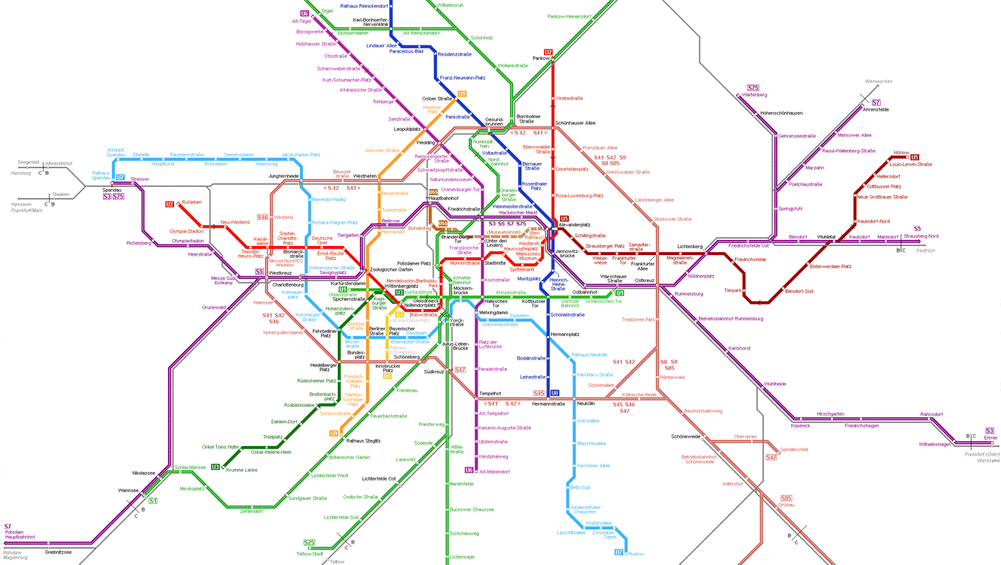
It is part of the reason why all subway maps worldwide look the same today. If Harry Beck solved a problem so accurately in London in 1933, and subway map designers worldwide (facing exactly the same problem) have instant access to that solution, why wouldn’t they follow Beck’s example?
Globalization creates expectations
Moreover, people traveling worldwide start to expect a subway map to look similar to the ones they know. It helps them navigate and understand that map more quickly. This is important as it means a similarly designed map now addresses the needs more accurately than a map that looks different.
And look, from a graphic design point of view, all subway maps look the same everywhere in the world…
And look, all coffee shops look the same everywhere in the world… :)
I admit that when traveling, in need of coffee, I may look for a bar like this because somehow I expect that coffee will taste great in such a place. Additionally, I presume it’ll be easy to figure out the menu and how to order.
Especially in digital the same idea rings true. And it has even grown into a powerful design principle: if we want people to be able to interact and understand our interfaces, we have to build them similar to others. It’s what people expect nowadays. It’s what makes them more usable.
This famous quote by Danish usability expert Jakob Nielsen underlines the thought:
Users spend most of their time on other sites. This means that users prefer your website to work the same way as all the other sites they already know.
Is sameness a problem?
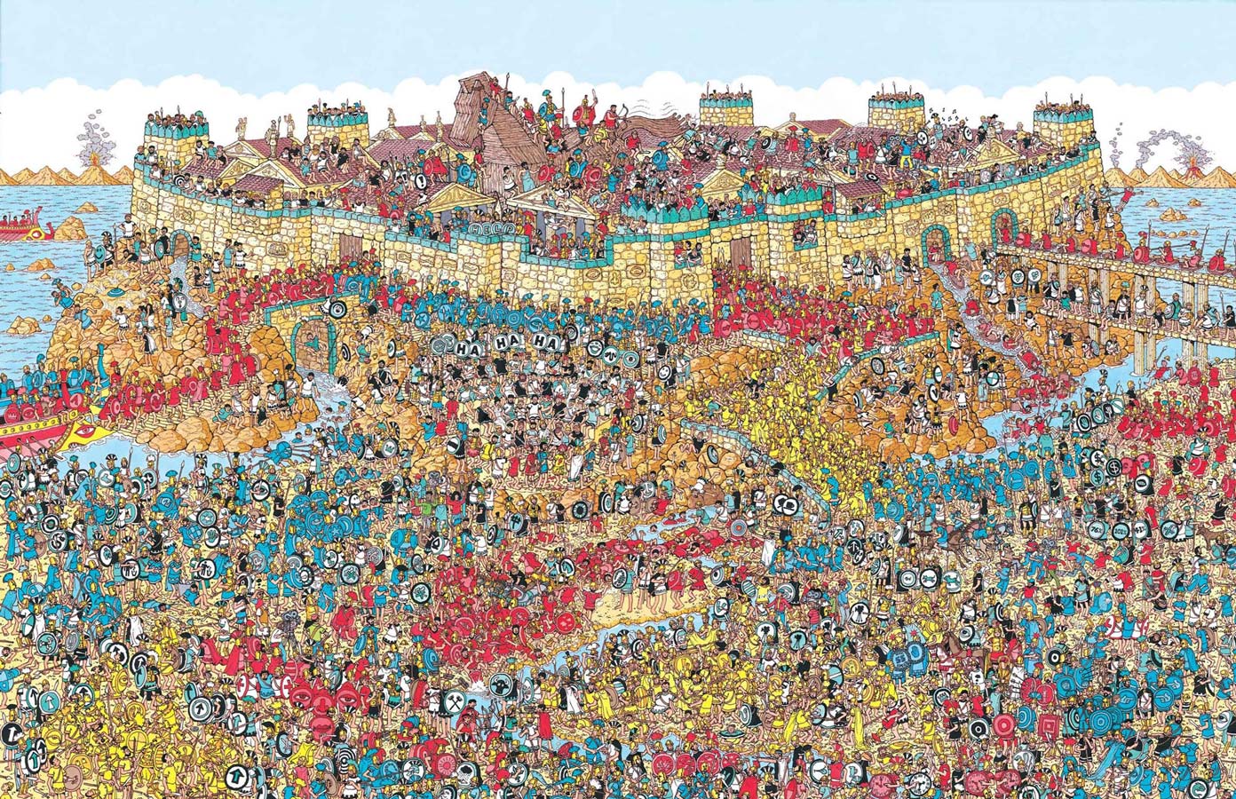
Is this a problem? From a branding perspective, you could say that yes, this is problematic. Branding is all about identification. Just like people, brands have the fundamental need to be noticed. Yet the only thing that allows people to identify you from your peers is your difference. If Waldo wouldn’t have the red and white hat, or the glasses, no one would ever be able to find him.
To identify someone, you need to be able to differentiate that person from the pack. And herein lies the problem with sameness: it rules out individuality and identification. If all brands look and behave the same (basically turning into blands), why would customers choose yours over the others?
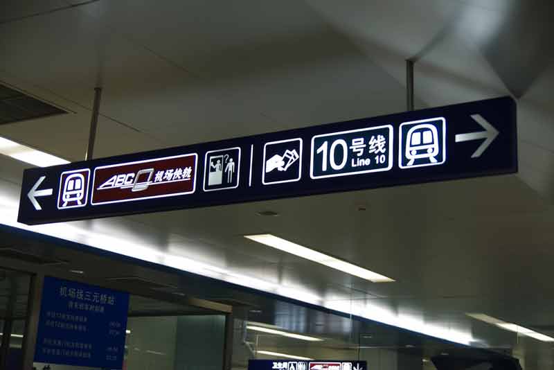
However, from a consumer perspective, you could say it’s not a problem at all that everything looks the same. Uniformity is convenient even. If you ever arrived in an international airport where you cannot interpret the written language, you will thank god for sameness:
And when you get out of the airport, trying to get to your hotel fast, you’ll be happy to see a subway map that is designed just like all the subway maps you already know.
With a row of people waiting in line behind you, you will be relieved to see the subway ticket vending machines operate similar to the ones you already know. You don’t want to look stupid trying to figure out how it works.
And as you browse your hotel’s website, you can only hope it has a recognizable navigation system that follows international web design standards.
Standardization is convenient. Seen from this point of view, it’s pretty clear: designers and brands should learn to embrace sameness. Sameness in how websites, apps, ticket vending machines and other interfaces work, makes them easier to use. It’s as simple as that.
The paradox of sameness in branding
And so we arrive at an apparent paradox: on the one hand brands have the need to be different. But on the other hand, consumers want brands to behave and look the same, so they are predictable and usable. It makes them feel not so stupid. This basically means brands also have the need to be similar.
At Base, we experienced this firsthand. A couple of years ago, our very own studio website looked like this:
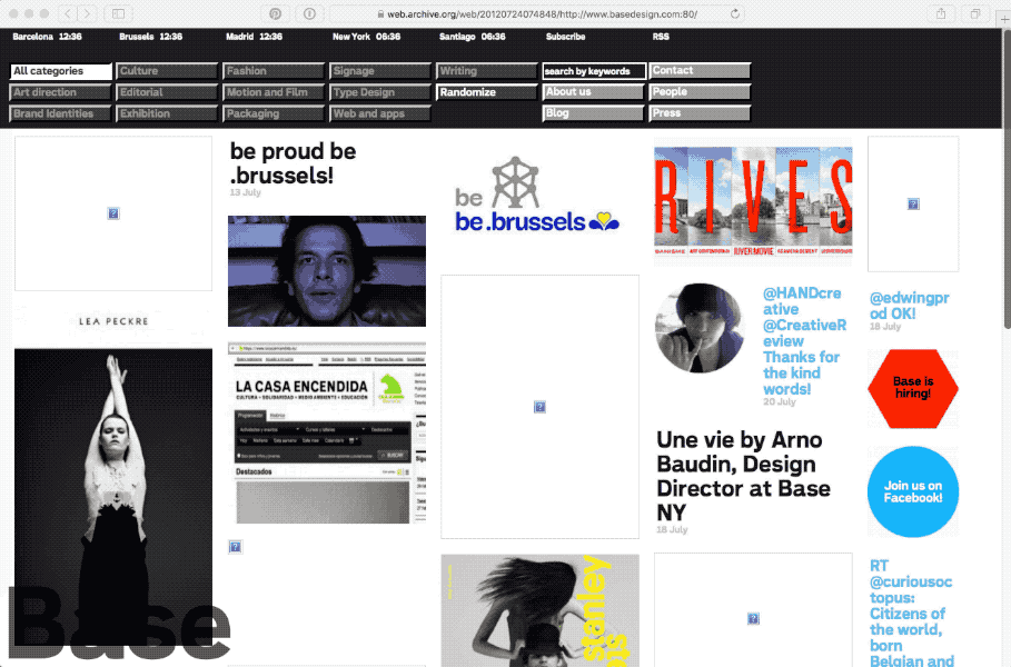
There was some unusual things going on on our home page, and it looked different for sure. Especially the navigation pattern was quite quirky. However, we noticed some visitors were struggling. To make it more usable we redid our website a while ago. Now it looks like this:
It certainly looks more professional. People find it easier to navigate and understand what Base is all about. But by making this change we also realized that we started to look exactly like most of our competitors.
And hmm… that’s not good. Or is it?
Perhaps without realizing, we’ve run into our own manifestation of the paradox of sameness in branding. On the one hand, our website kind of makes us look like all the others. On the other hand, our online presence is very in line with the current web design standards and trends. And because of that, people instantly feel comfortable using our website. It’s what they expect from a high profile branding studio. It makes us look trustworthy, and helps them dive into our content.
That last point is not a mere detail. It’s pretty important even. If a standardized interface makes us more accessible, then maybe that shouldn’t be a problem per se? Especially since digital has given us so many more ways to differentiate ourselves than just by our visual interface.
Beyond the interface
And this is exactly where we come to an important realization: the richness of expression through digital is so dense and so full of possibilities, that the standardization of the interface actually doesn’t matter that much. It’s beyond their interface that brands should manifest their personality.
The UI layer is not where brands should differentiate. Consumers expect interfaces to be usable. And the shortest way to a usable interface, is standardization. And if there’s anything we’ve learned from the story above, it’s that this is totally ok. There’s so much more to differentiate with, than the mere interface.
But if not by the interface, how do we then help brands to differentiate themselves through digital?
It always boils down to this: brands are like people. And as much as we recognize them by their looks, they also have their own distinct characteristics. They stand out through their attitude, their personality and their own ideas.
Think about an encounter you had lately with a person you met for the first time. Maybe it was at a party? Maybe even a work meeting? What is striking is that what you remembered the day after, was most likely not how that person dressed exactly. Nor was it the precise words she said. What remained though is leftover feelings.
Maya Angelou once articulated this idea perfectly:
I’ve learned that people will forget what you said, people will forget what you did, but people will never forget how you made them feel.
Those feelings can be vague sometimes, even hard to put words on. But what is clear is that if we want people to remember brands, we have to feed them something richer than just a logo, a color, a typeface and an interface. Through its inherent richness, digital is the perfect communication medium to help with that.
How to evoke feelings?
And so, as we reach the end of this article, the final question becomes: how can we use digital to evoke feelings?
Unsurprisingly perhaps, there is no simple answer. Digital as a medium hasn’t revealed some kind of magic one-size-fits-all formula. Nevertheless, it can intensify one of the many pre-existing tricks and techniques, some of which are literally age-old.
Storytelling is the first one that comes to mind, and is perhaps the most powerful. Digital offers many great ways to enhance a good story. Stories have evoked feelings and fascinated people for ages.
Another interesting way is to communicate addressing multiple senses simultaneously. This has proven itself to convey a message in a much more memorable way, as it helps to engage people emotionally. Digital technologies can activate sight, hearing, and even smell and touch at the same time.
A third technique involves participation. Participation can make a message stick much longer than a one-directional story. Interaction is a degree of participation, and is inherent to digital. Whether it’s a simple tap-to-reveal on a web page or a smart conversation with a bot, clever interaction grows emotional engagement.
(I smiled recently when I saw what Nøcomputer had done with their live interactive installation for New Balance, tracking fashion exceptions during NY’s Fashion Week.)

As a final example, let’s consider how some of the most powerful brands of today (Google, AirBnB, Uber, Waze…) have solved a consumer problem in a brilliant way, directly bringing delight. Delight is of course a powerful emotion you will almost certainly remember. Digital brings brands the potential to help people in many new ways, to deliver delight.
Of course this list is not exhaustive, but that’s not the point. In the end it’s all about taking advantage of digital’s richness to help evoke the right brand experience. This will always involve understanding what the brand’s audiences want, and delivering on it in a unique way.
And so it seems, there is no new thing under the sun.
Conclusion
As much as sameness in digital is real, it shouldn’t be too much of a problem. Standardization of interfaces does bring clear consumer advantages. On top of that, digital has brought brands an extremely rich means of expression. This goes way beyond the interface. Brands should take full advantage of this by creating memorable digital experiences. A powerful way to reach memorability is by evoking feelings.
(This article is an adapted and written version of a talk I gave together with Thomas Léon for Base at Us By Night in Antwerp, Nov 23 2017).