The best UI typeface goes unnoticed
Clarity is the most important value of a well-designed user interface. Last time I blogged about pictograms. Let’s talk type today. Because even more than icons, a typeface can make or break clarity.
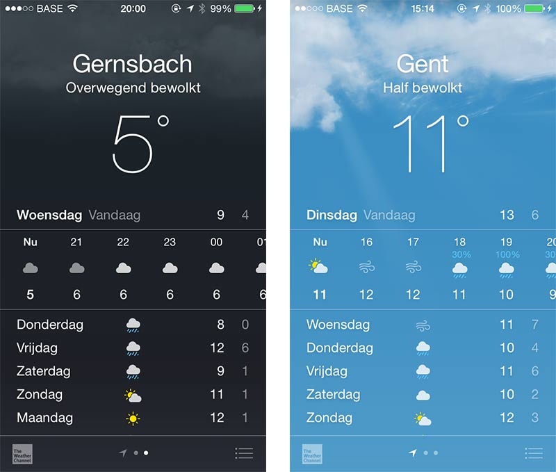
On the surface, most of an app’s UI is exactly the type it’s set in. That’s why it matters so much. As good as any app can serve as an example, but let’s start with Weather for iOS: apart from the decorative clouds and inevitable icons, its UI is essentially pure text:
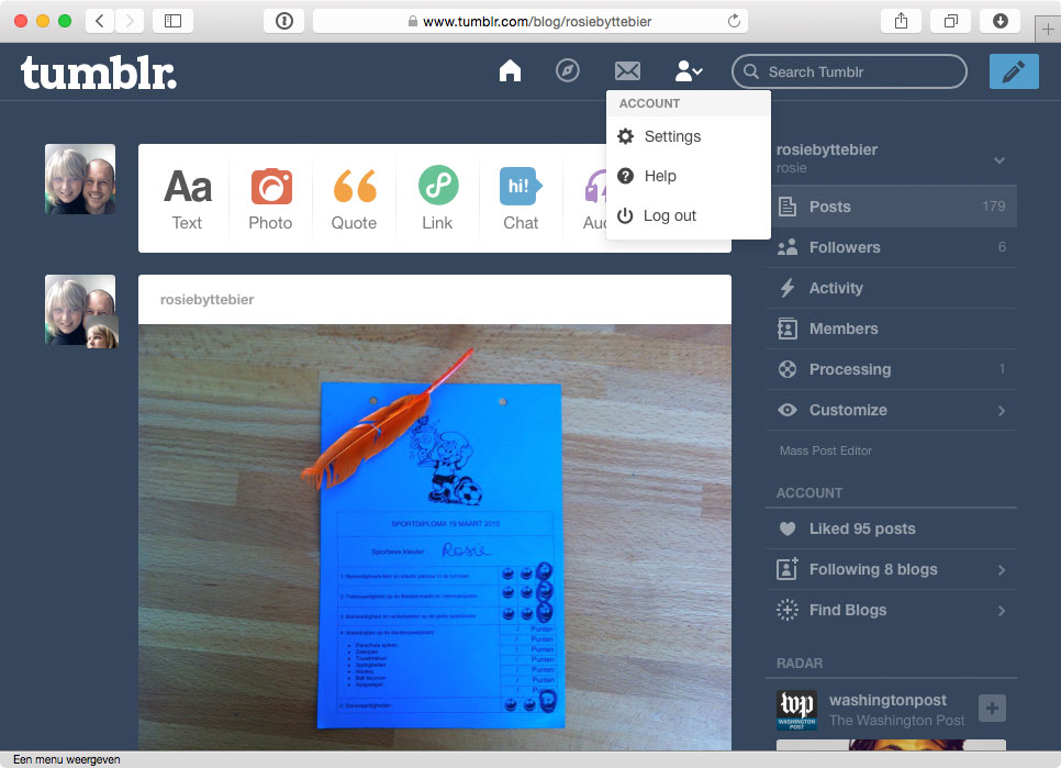
Tumblr’s back-end user interface is almost entirely made up of text and icons:
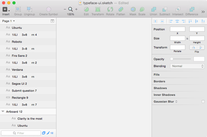
The same goes for desktop software like Sketch:
Back in 2006, iA wrote an enlightening blog post on that matter, called Web Design is 95% Typography. Here’s a remarkable quote:
A great designer knows how to work with text not just as content, he treats text as a user interface.
Text is UI. And of course typography is so much more than just a typeface or the text in an app. It’s about balance, positioning, hierarchy and structure. The screenshots of Weather clearly demonstrate that. Still, your typeface choice is a very big deal.
So, if we go back to the raw letterforms, what exactly are we looking for in a good UI typeface? What makes it a good fit for a user interface? Tobias Frere-Jones, renowned American type designer (of Gotham among others) once said:
All text needs legible typefaces. But especially at interfaces, our eyes need fonts that cooperate rather than resist.
That makes a lot of sense, knowing that clarity is a good UI’s foremost characteristic. Frere-Jones’ quote underlines the idea that above all we need a clear typeface. As an interface is mostly type, we need to make absolutely sure the font doesn’t introduce friction between the product and the user.
Have a look at these two typefaces:
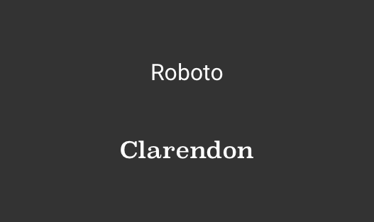
Clarendon is beautiful. But in all its shiny glory, it screams for attention and may therefor distract our users from tasks and goals. In user interfaces, we want the typeface to go unnoticed and the user to get things done. Roboto may look a bit impersonal, even boring at first sight, it is by far a better choice.
Additionally, a good UI typeface has to be extremely clear in small sizes. Check the home screen on your smartphone. You’ll see text easily gets tiny in software. Also, have a look at iOS Calendar:
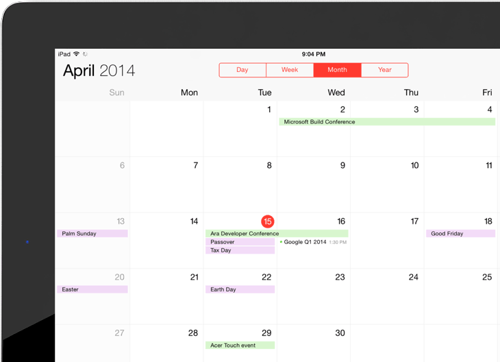
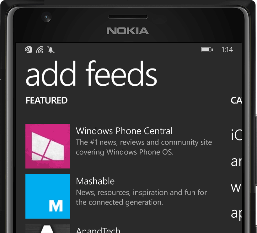
Microscopic! Here’s Nextgen Reader on a Windows phone. (I know the scale isn’t very representative in these images, but it should give you an idea.)
As text gets really tiny, you’ll probably want to look for a font with a large x-height. There’s only a few pixels of available space to draw a glyph, so a larger x-height takes full advantage of them.
That being said, now half close your eyes. Which of these two small text buttons is more readable?
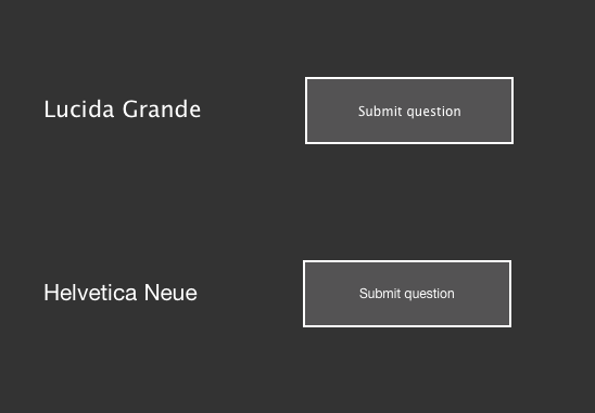
If you didn’t before, you now understand all the fuzz about Helvetica as an interface font. When Apple released Yosemite, the design community commented sharply on the switch from Lucida Grande to Helvetica. It just isn’t very legible, especially at small font sizes on low-res screens. It breaks clarity.
Have a look at this screenshot. Ugh! What’s going on there?
German typographer Erik Spiekermann (of Meta and Fira among many others) boldly said this on his blog:
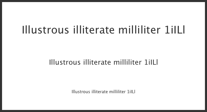
Helvetica sucks. It really wasn’t designed for small sizes on screens. Words like ‘milliliter’ can be very difficult to decipher.
Let’s see. Half close your eyes again and experience it for yourself.
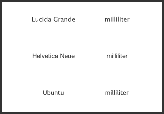
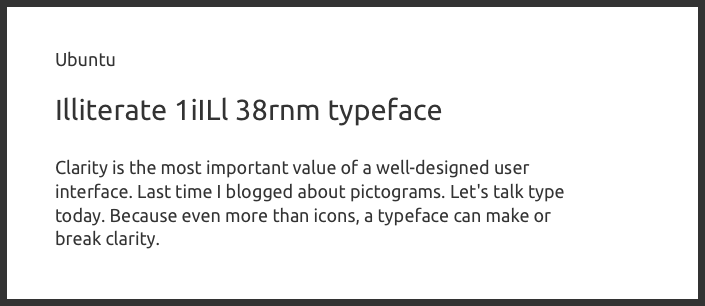
No need to argue, Helvetica is not the most legible. However it’s remarkable how well Ubuntu performs in the above screenshot. Especially an interface typeface has to provide enough distinction between its various glyphs. Think about passwords, user names, data tables, drop down lists… Your interface must display them in an unambiguous way. You don’t want your users to pause for even a fraction of a second to decipher glyphs and shapes.
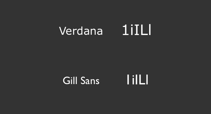
Gill Sans is perfect to illustrate that as well. It’s a great typeface, but it’s simply not suited for UI design. The first (1), third (capital i) and last (lower case L) character look exactly the same!
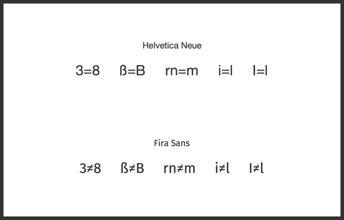
Helvetica suffers the same unclarity. Erik Spiekermann once made a visual comparison between DB Sans and Helvetica that exemplifies this. Let me do the same with Helvetica and Fira Sans. Half-close your eyes. You’ll likely see how these glyph pairs set in Neue Helvetica get mixed up very easily. Confusing vs legible:
Now that we know what to look out for, the remaining question is of course: what then is a clear UI font? Let me show you a handful of excellent, albeit obvious choices. It’s sans-serif fonts that were designed specifically for use in interfaces. Well-hinted for small font-sizes and low screen resolutions.
First there’s Lucida Grande of course. Designed by Charles Bigelow and Kris Holmes, it has been used throughout the Mac OS X user interface from 1999 to 2014. It was retina optimized in 2013. It’s almost identical to Lucida Sans, but some glyphs were adapted to look clearer in small font sizes on screens. You know why.
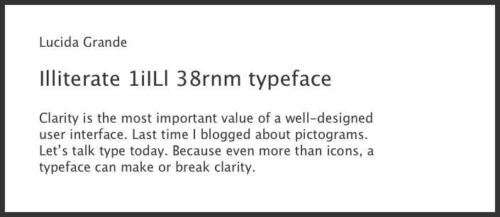
Although the difference between a capital i and a lower case L may get harder to distinguish at small font sizes, it still works.
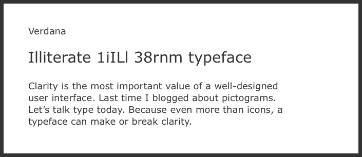
Verdana, like Georgia, was designed by Matthew Carter for Microsoft, and released in 1996. It was hand-hinted until it became very legible at small sizes on computer screens. Special care was given to emphasize distinctions between similarly-shaped characters. Again, you know why.
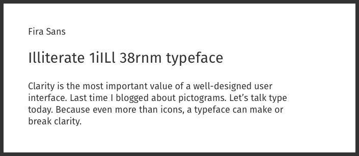
Fira Sans is the Firefox OS typeface. It was designed by Erik Spiekermann and Ralph Du Carrois for Mozilla and released in 2013 in 4 weights. It received a huge update in 2014. Fira is closely related to Spiekermann’s Meta which is used as the brand typeface of the Mozilla Foundation. It looks great on the web.
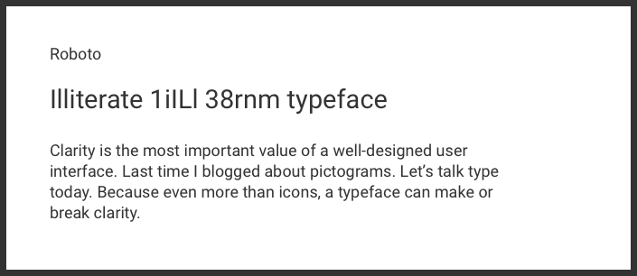
Roboto was designed by Christian Robertson for Google. It has replaced Droid as the Android system font in 2011. Roboto was subject for debate when it was initially released, but has since been refined extensively correcting many earlier ‘mistakes’. Roboto has been “created specifically for the requirements of UI and high-resolution screens”.
Ubuntu was designed by Dalton Maag and released in 2010 as the default typeface of Ubuntu OS. Ubuntu was developed primarily for use on screen displays. It probably has the most distinctive look of all faces mentioned here. That can or cannot be a good thing in the case of your app.
Other notable mentions include Segoe UI, introduced in Windows Vista and later refined. San Francisco, the system typeface for the upcoming Apple Watch and definitely one to watch out for. Droid Sans and Open Sans, Aller Sans, Source Sans Pro, Azuro, PT Sans…
All these typefaces definitely don’t burst with personality or creativity, yet they’re crammed with clarity. And in user interface design, that’s only a good thing. As most of our app’s UI is the type it’s set in. We’d better take good care of it.