Design for the bigger problem
I watched this video yesterday of an excellent Ted talk by Paul Bennett, designer at Ideo. Although it dates back to 2005, its message will never get old. Somewhere halfway Bennett talks about designing a handheld device for use by nurses during a radical medical operation. Here’s the anecdote (6 min 51 sec – 8 min 25 sec):
There’s so much to love about that story. For one, Bennett illustrates the prime reason we should never merely execute what we’re asked to design. This may seem counterintuitive, particularly if the question directly comes from our client, perhaps a field specialist or the product’s main stakeholder. But it is vital. In Bennett’s case Ideo would have designed a less usable device otherwise, leading to a worse patient experience.
When designing user interfaces, the same rule of thumb applies: never start designing anything until you deeply understand the problem at hand. Go back to research, talk to real users. Be that 3-year old kid again that answers every answer with another ‘why?’ until all conversations ultimately end at the beginning of the universe.
Why? Because a common and seemingly innocent question like: “Can you design this extra flow in the UI?”, is in fact an opinionated, misleading request. It inherently suggests a solution to a design problem you don’t fully grasp at this point in time. You’re not hired to add cosmetics to half-assed solutions, you’re here to solve users’ problems through design in the best possible way.
Punching out
A few years ago I was consulted as a user interface designer for software that supports Human Resources divisions. One day I was asked to design a new workflow that would make it easier for users to find out where our software was missing required input. “It’s come to our attention that more and more users ask for functionality like that.”
That sounded like I needed to get some research done. During a field visit one user’s story grabbed my attention. She worked at a large healthcare company. She quietly told me that she was indeed searching and fixing missing required data each week day for about 3 hours a day. “I’m afraid we really need that lacking input, as our company can’t pay its employees’ salaries without it.”
We sat together at her desk and I asked about the most common types of missing data she encountered. Pretty soon it became clear that 80% of her workload was created by missing time registrations. But why were they missing? Our assumption was that most employees forgot to clock off at the end of their shift. That’s why it made sense to design a flow that helped our users find and repair these missing registrations. Oh boy we were wrong.
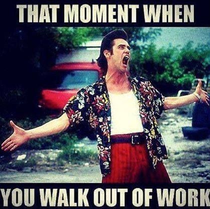
I decided to ask more about how employees are supposed to punch out. I learned that after every shift hundreds of employees arrive en masse at the clocking devices, trying to go home as quickly as possible. They clock off scanning their personal badge, wait for an affirming beep from the device, then rush out to be home with their families. Picture this, times hundred:

Now, it turned out, time and time again, dozens of scans never got registered. (Meaning dozens of time registrations were missing in our software.) Why? At rush hour, the clocking devices appeared too slow: the sound the employees heard was the beep of the previous person’s scan! Holy, that was extremely insightful.
To take away as much information as possible, I decided to ask my interviewee about her process of fixing these missing time registrations. Her answer:
It’s simple. For security reasons all employees must use their badge once more to open the exit doors. I write the name of the missing employees on a piece of paper, then search this Access database that has all entrance and exit times in it. I then subtract some minutes, write that time down again and input it in the software.
Design for the bigger problem
Astonishing! Now I could do two things: take clues from my client’s proposed semi-solution, design the flow I was asked to design and reduce the user’s workflow by 10% or so. Everyone happy. Or I could design for the bigger problem, something that wasn’t recognized at first, and reduce this user’s workflow by 80% or so. Delight.

Throughout the years I’ve found that the hardest part of design lies in fully understanding the problem you’re designing a solution for. In interface design this always boils down to user research. It’s so fricking important. Getting to know your users allows you to stop prejudiced design discussions and move forward with informed and clear steps. You’re not designing based on a dangerous mix of expertise and gut feeling anymore, but on reality. You’re not adding a visual layer to biased solutions proposed by product stakeholders, you’re designing for the real world.
So go out there and visit your users’ workplaces, observe as they work and talk to them. Find out why there’s post-its on the wall and a pile of papers on their desks. Watch them use your software while answering phone calls. Ask what makes them feel good at work and listen to what they say feels weird. Because if you don’t, there’s a big chance you’re only solving the wrong problems.